Morgan Stanley
Advisor, Team, and Branch Web Platform Design
Introduction
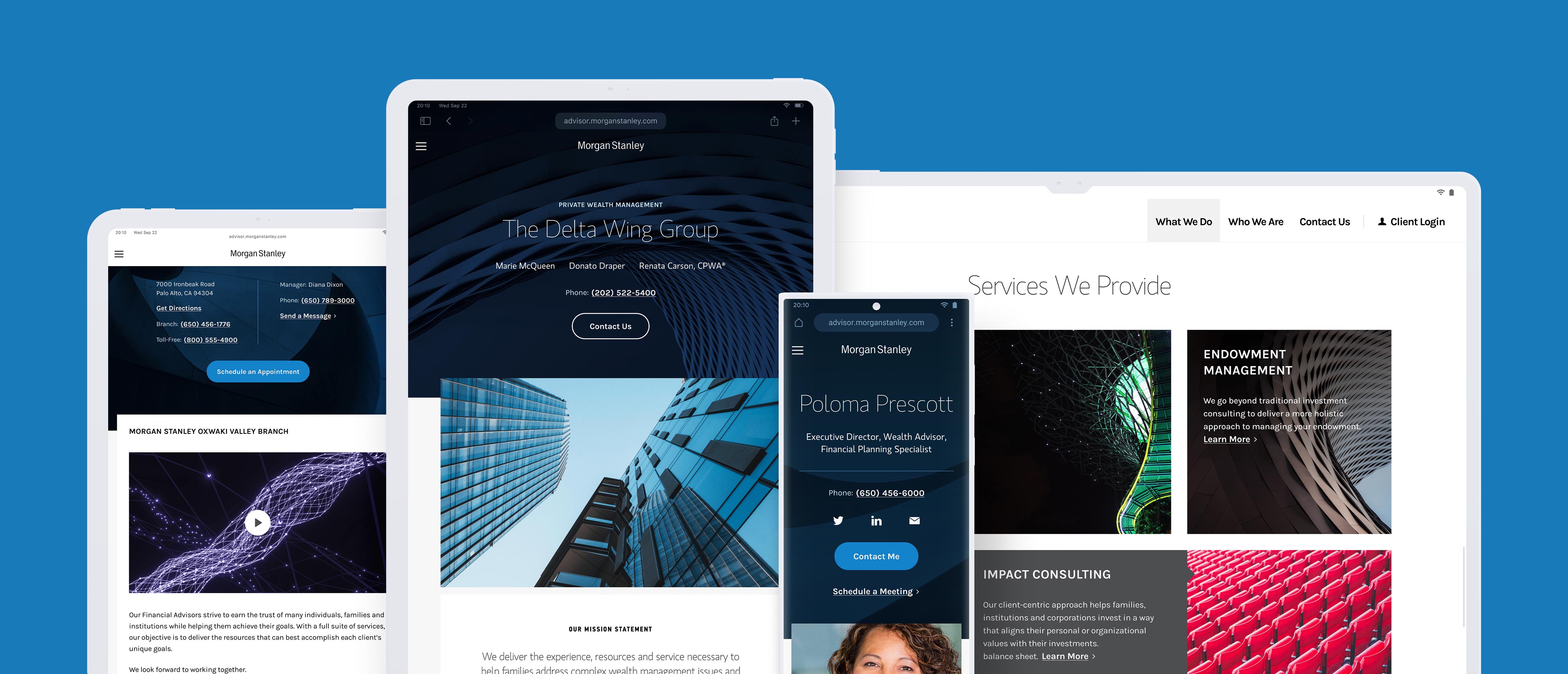
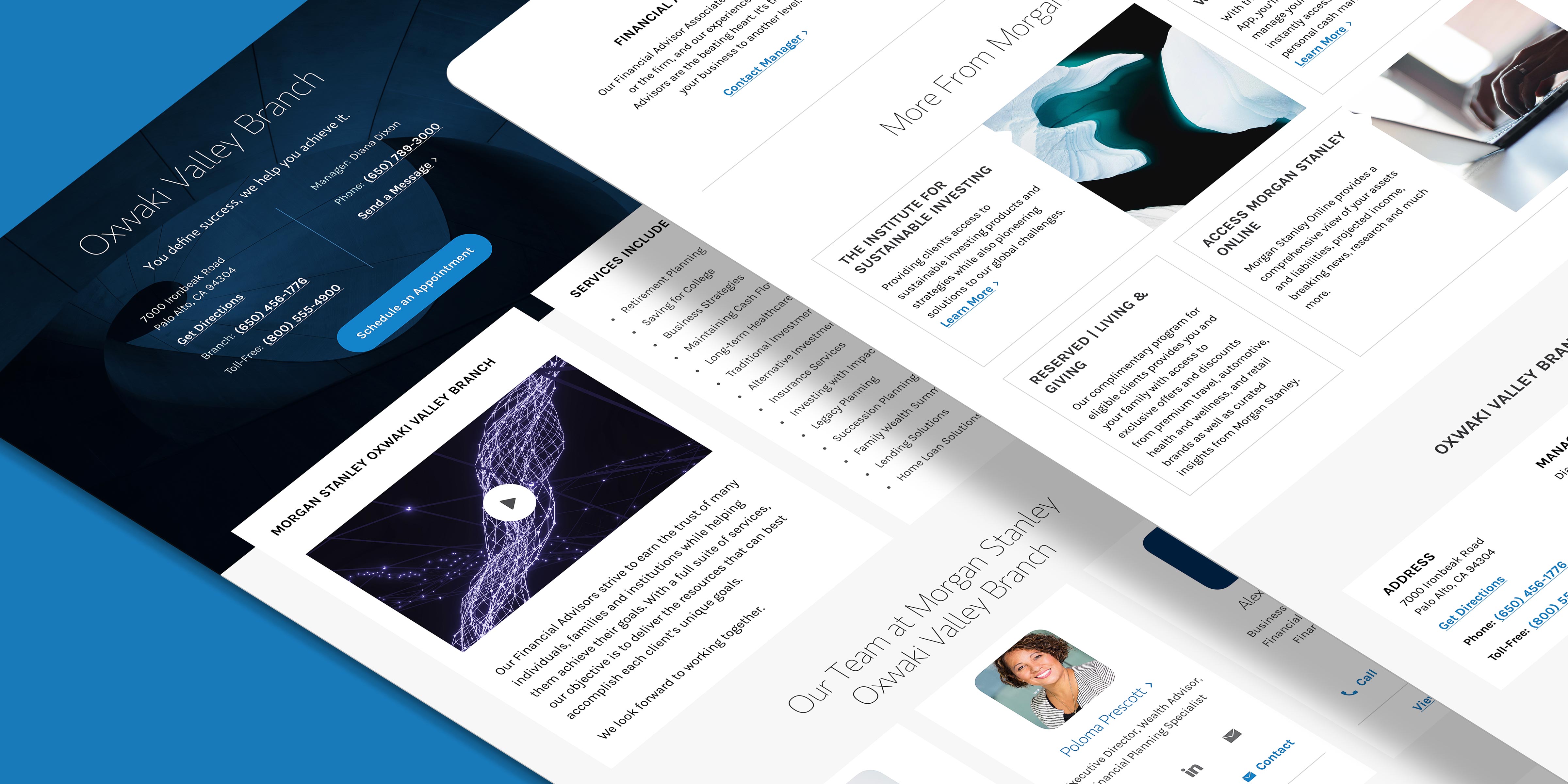
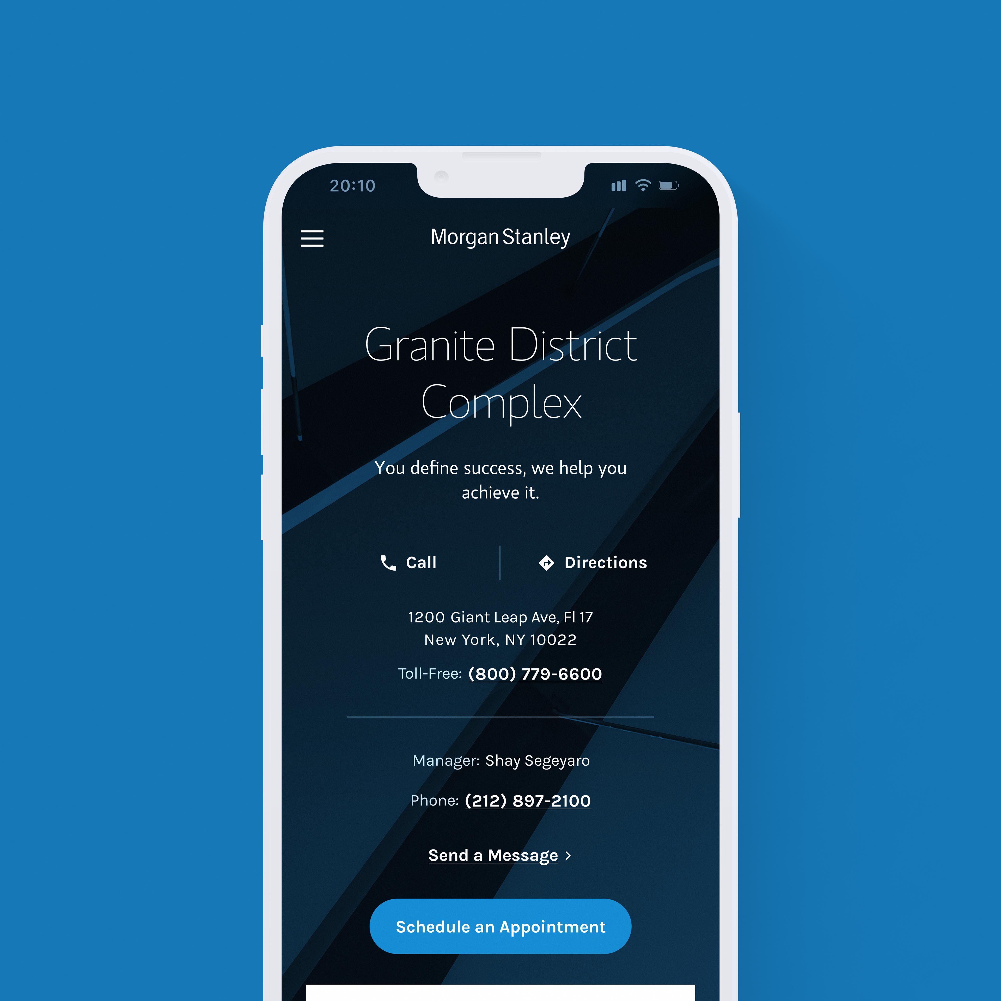
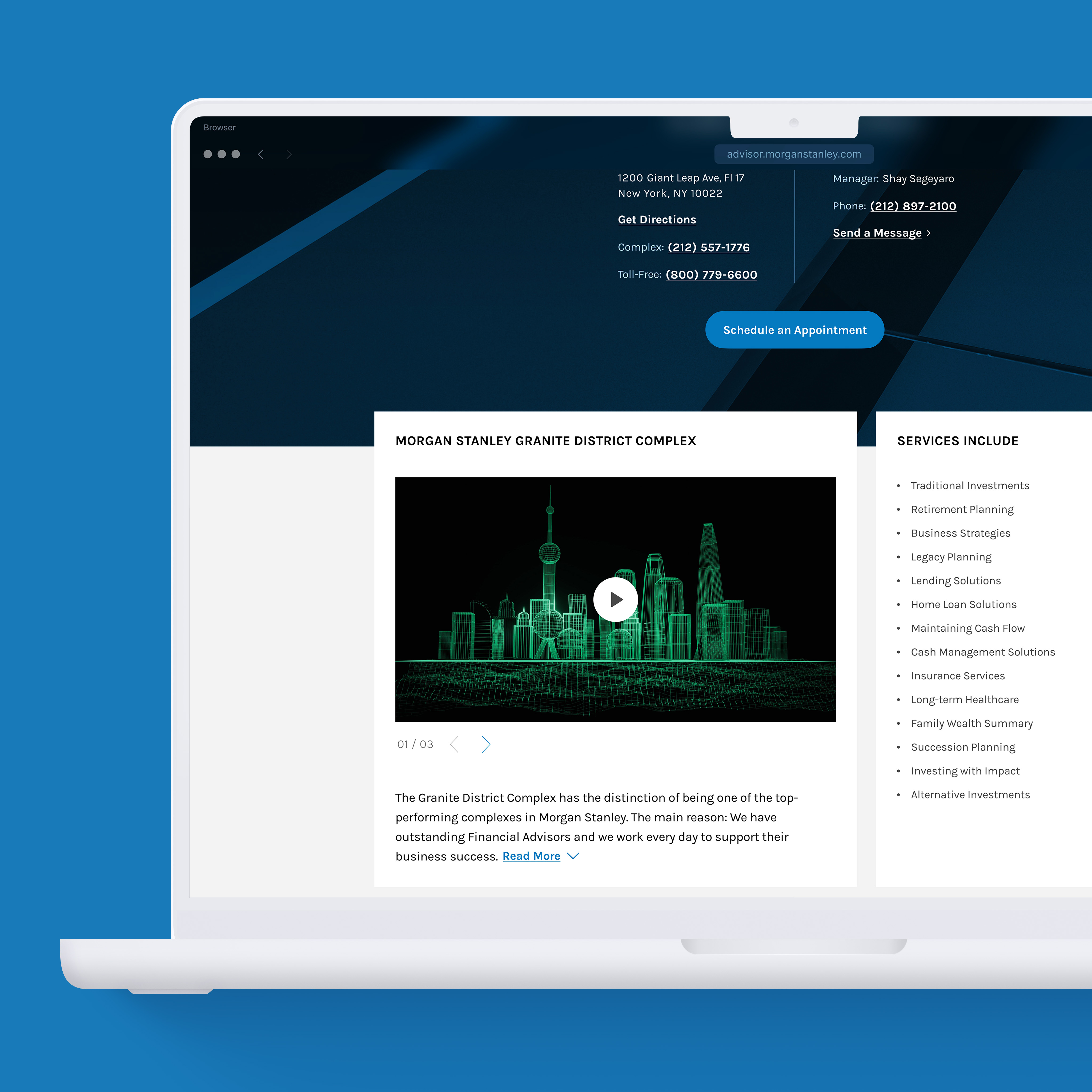
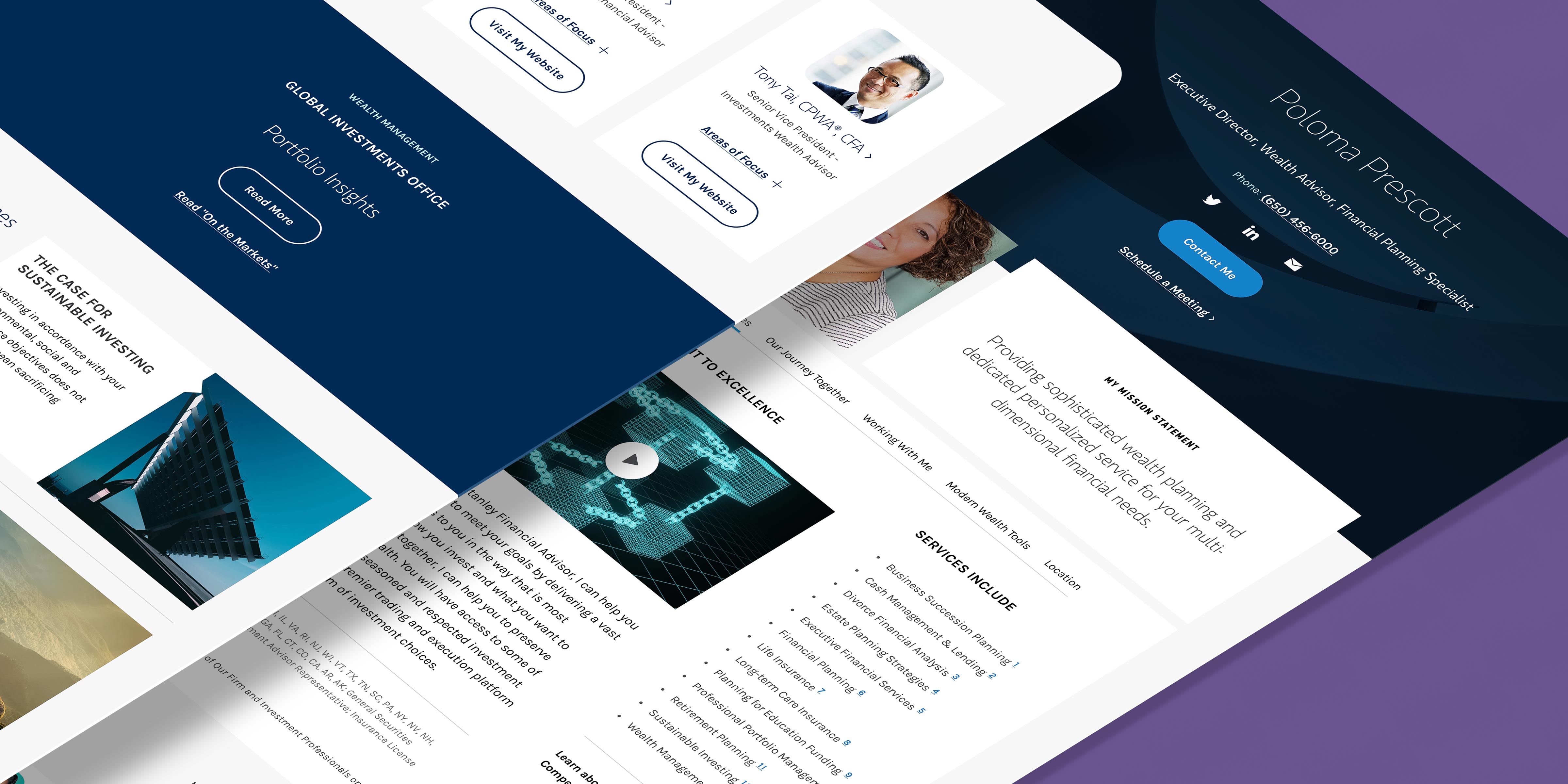
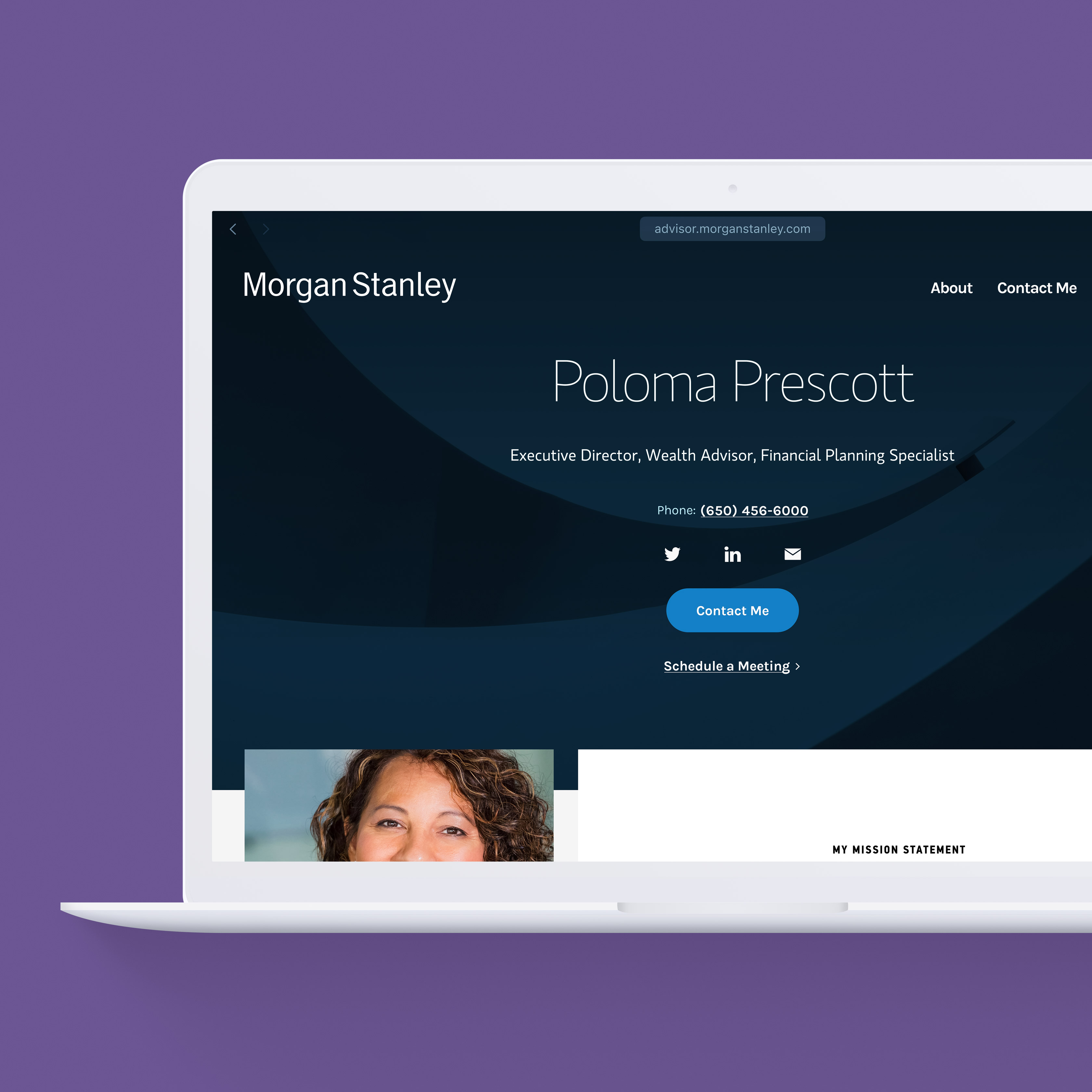
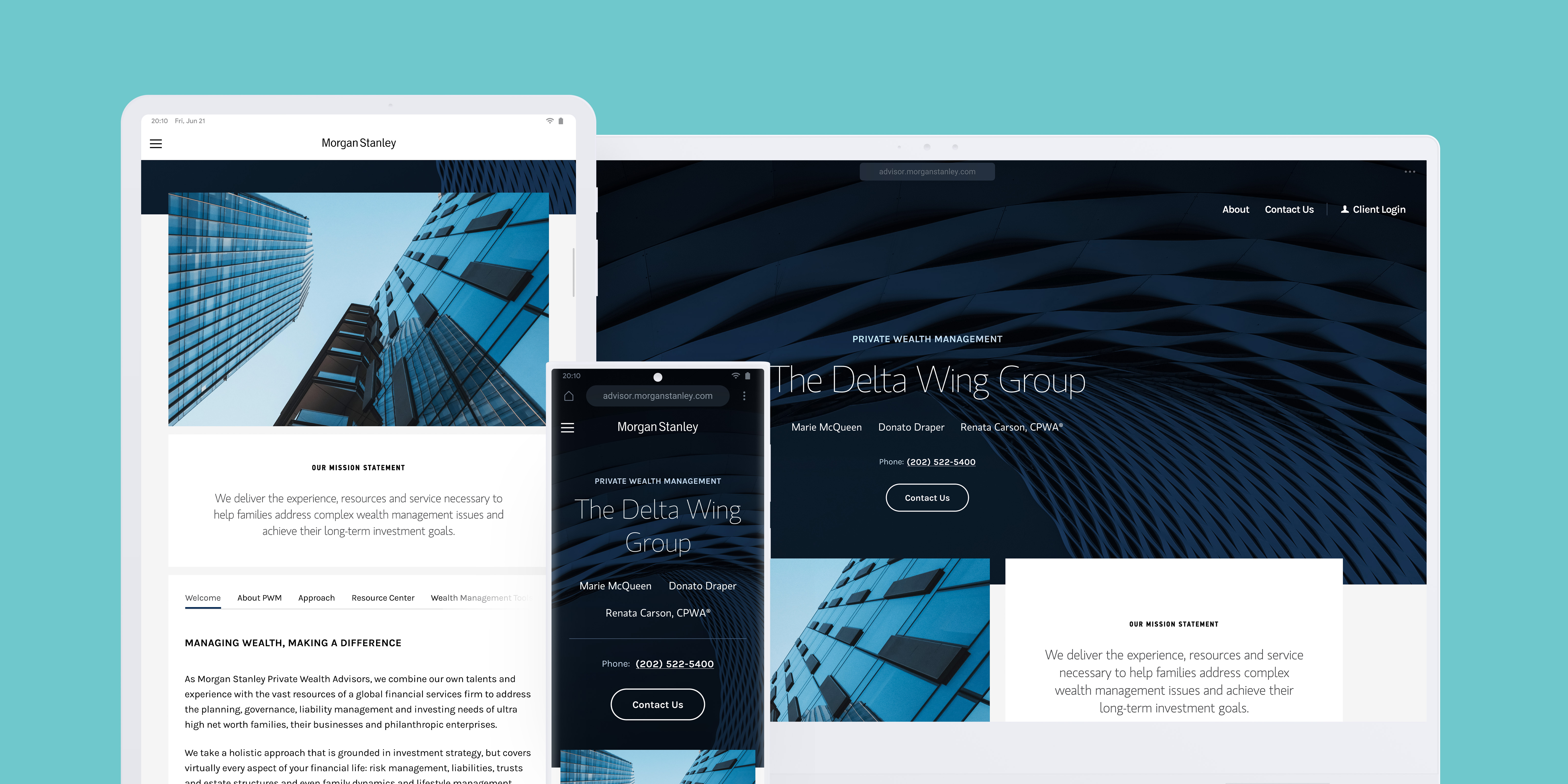
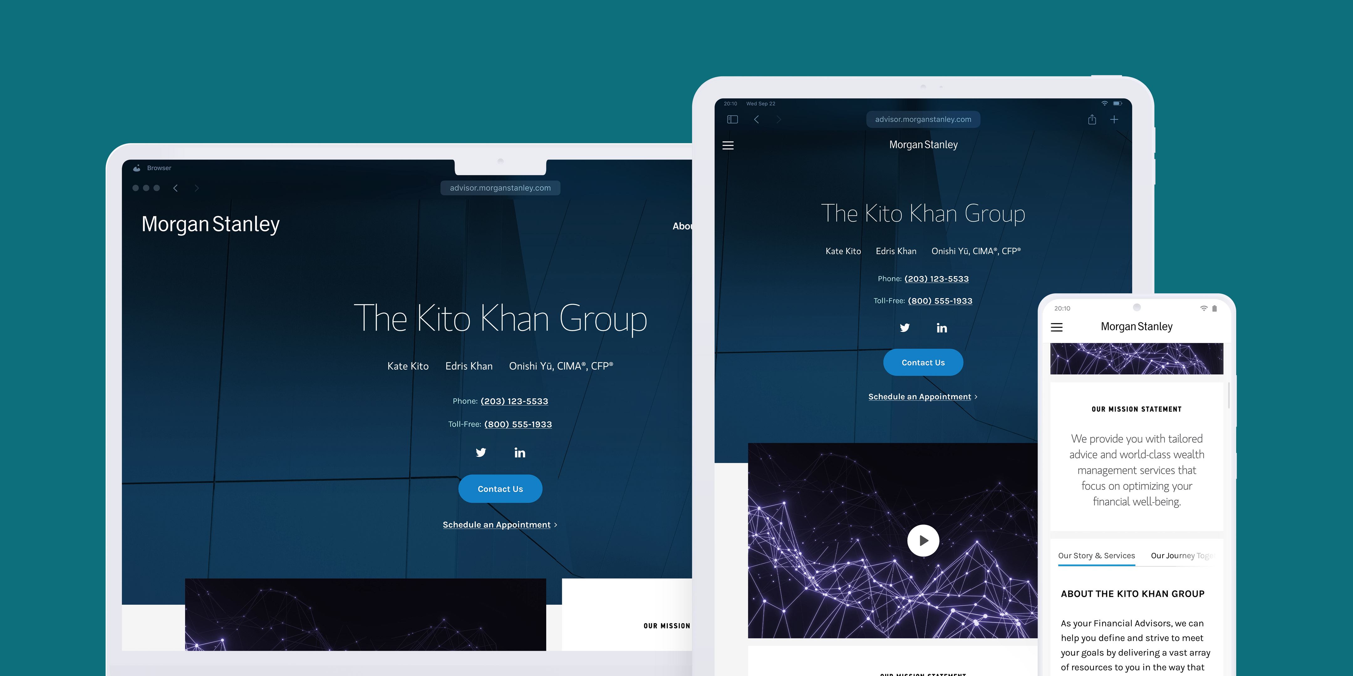
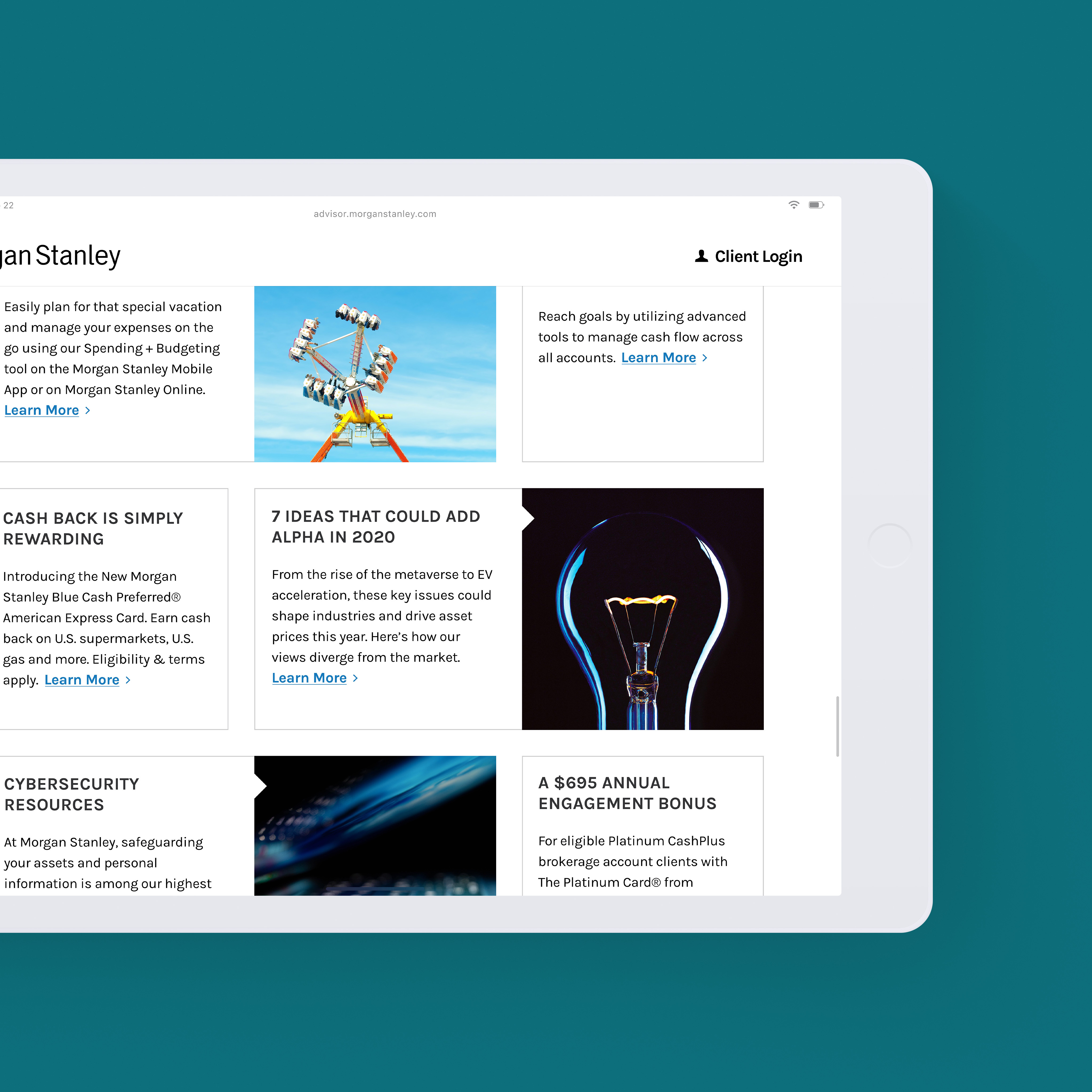
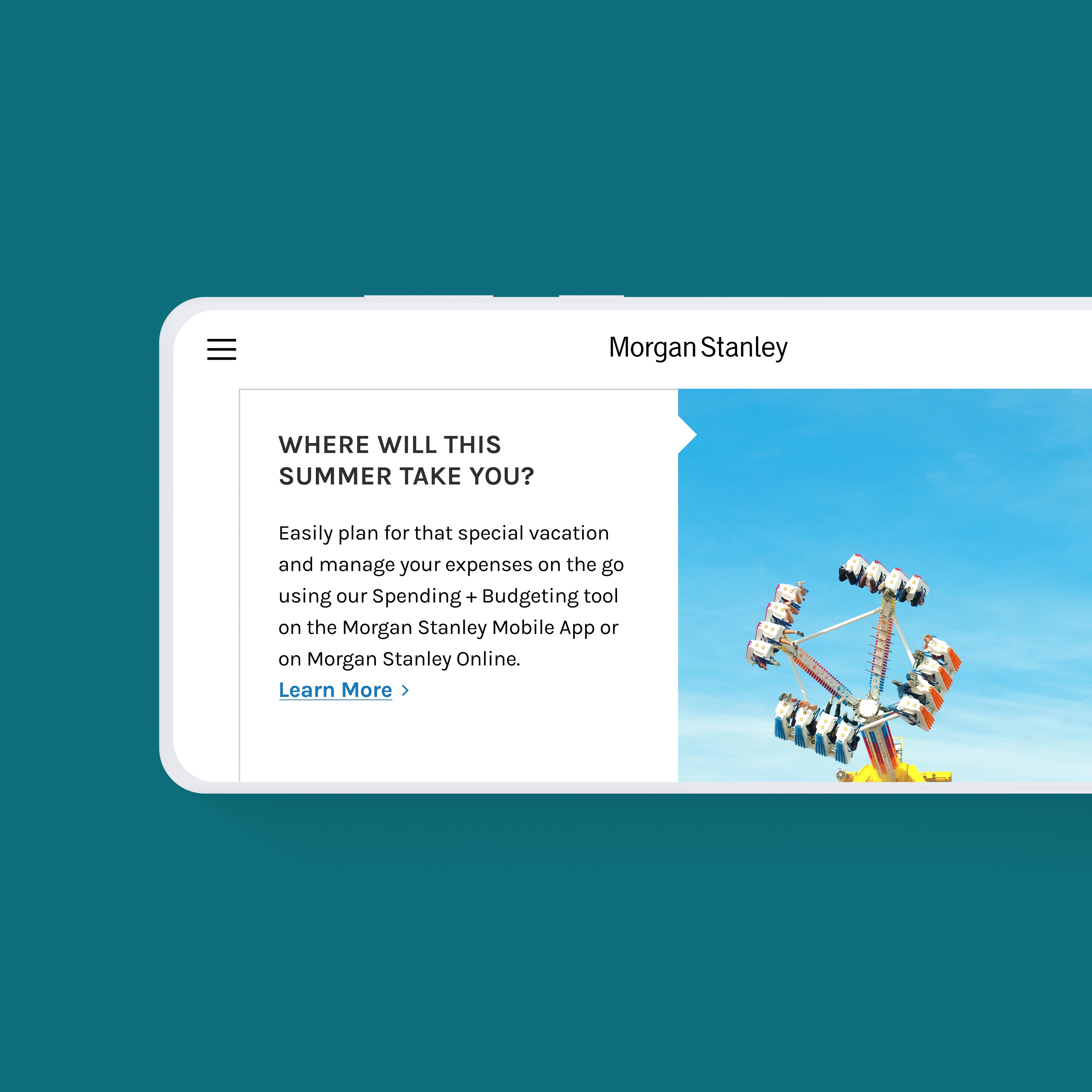
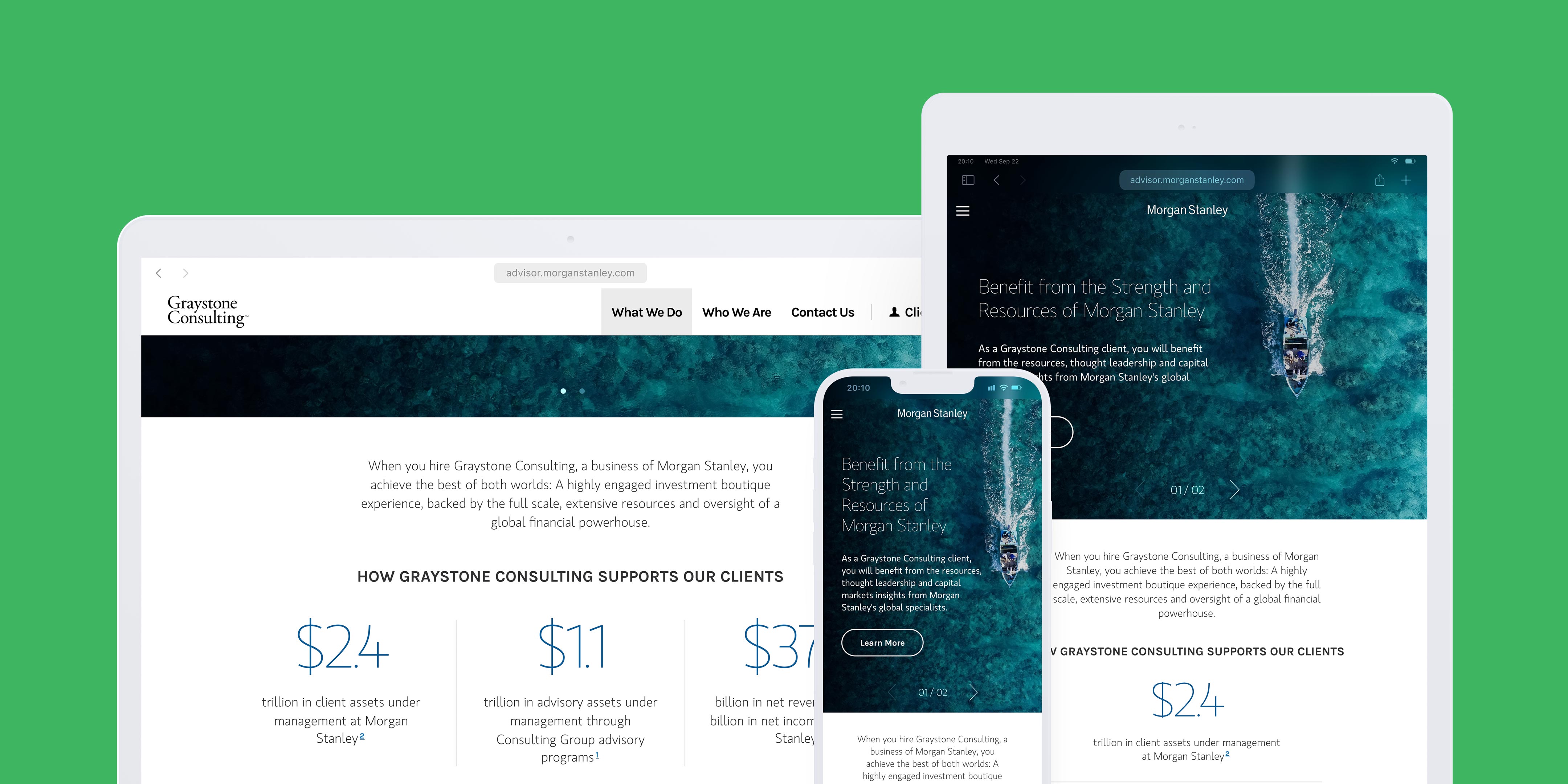
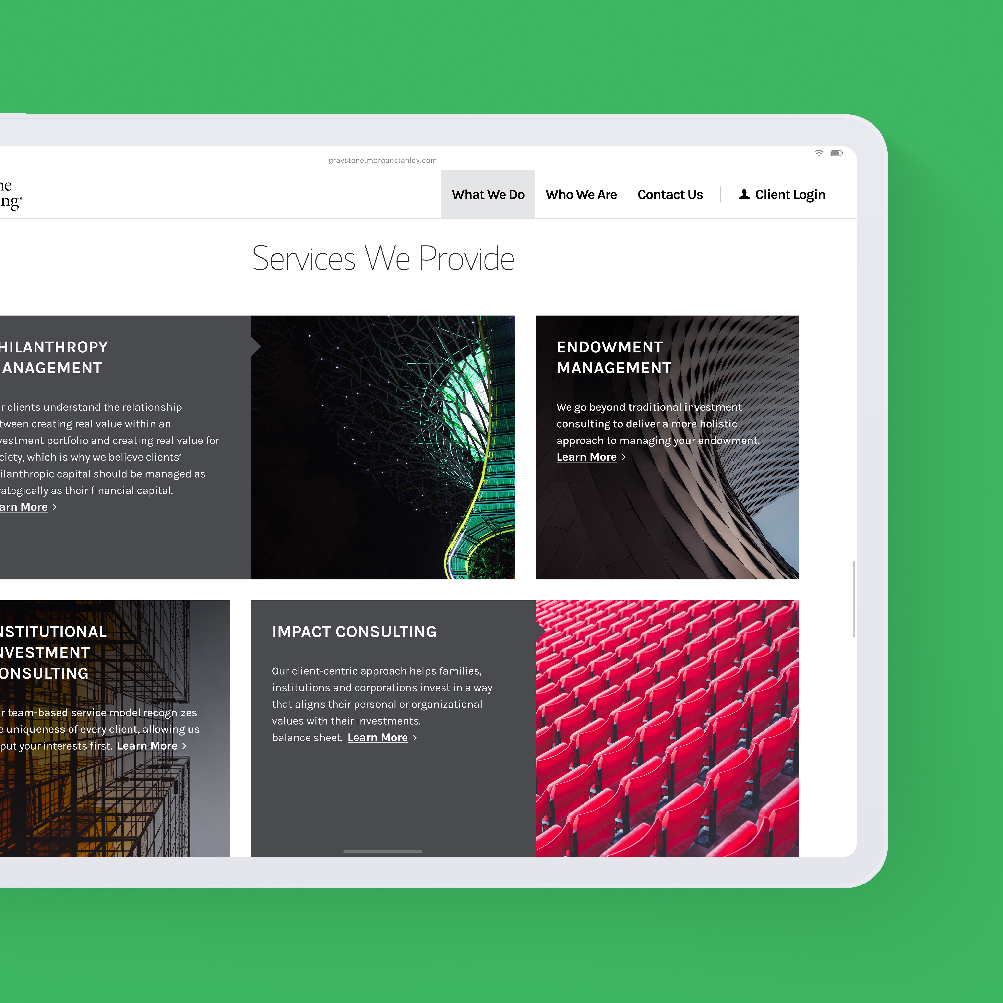
One component library, an entire network of microsites. Its atomic structure generates seven localized microsite types — including advisor, group, branch, complex, brand, and location finder — each resolving across six breakpoints from a single source.
- Role
- Lead UX Designer, Design System Architecture
- Scope
- Component system and responsive library spanning seven page archetypes, including location finder.
- Client
- Morgan Stanley
- Tags
- Design Systems, Component Architecture, Responsive Design, Financial Services, Accessibility, Interaction
Accessible & Inclusive
Accessibility governed the work: WCAG 2.1 AA compliance, semantic color tokens, per-archetype focus order, tested screen-reader behavior, and contrast re-verified through every palette change.
Repeatability
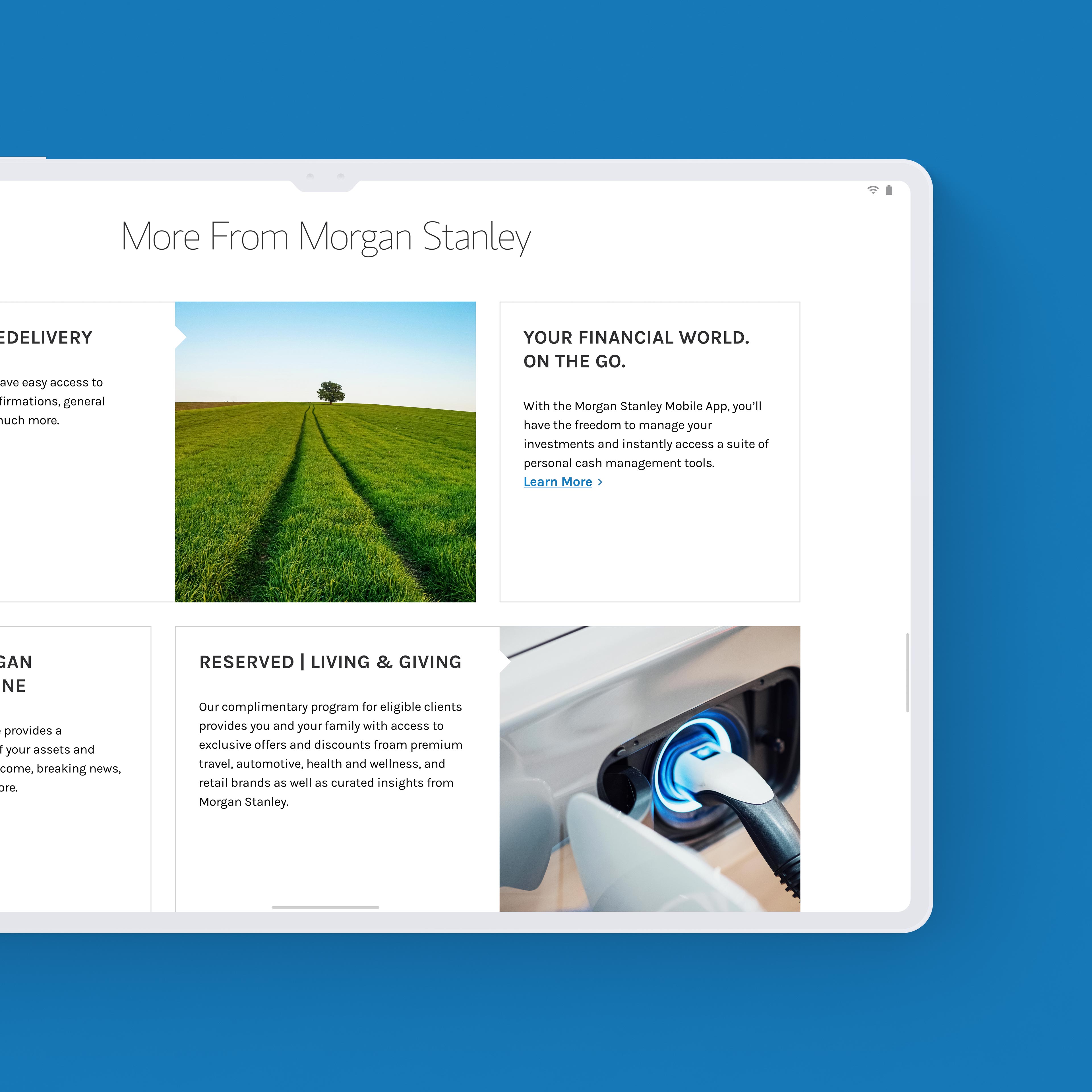
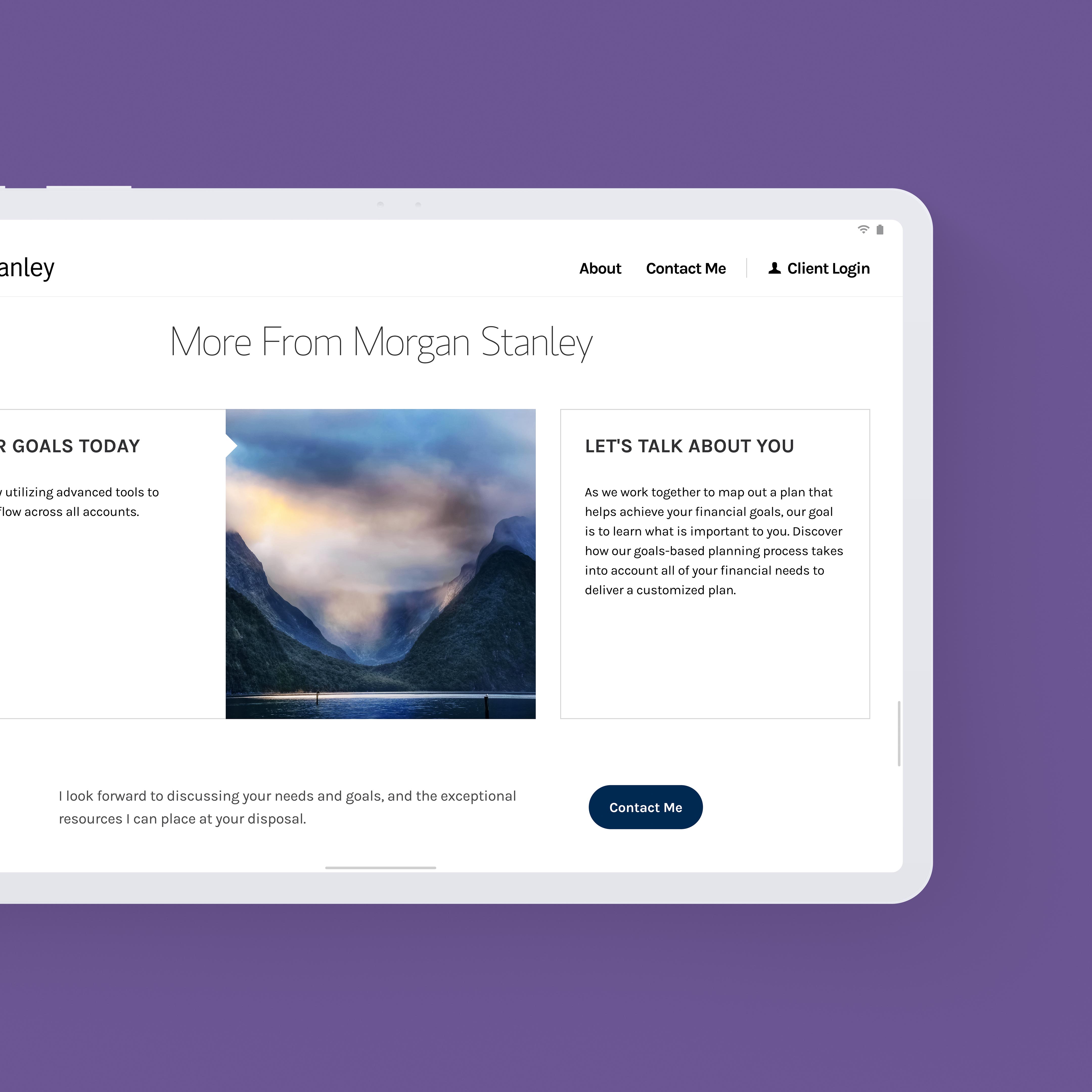
Reuse kept the platform consistent at scale, one component fix reaching every instance across two thousand placements.

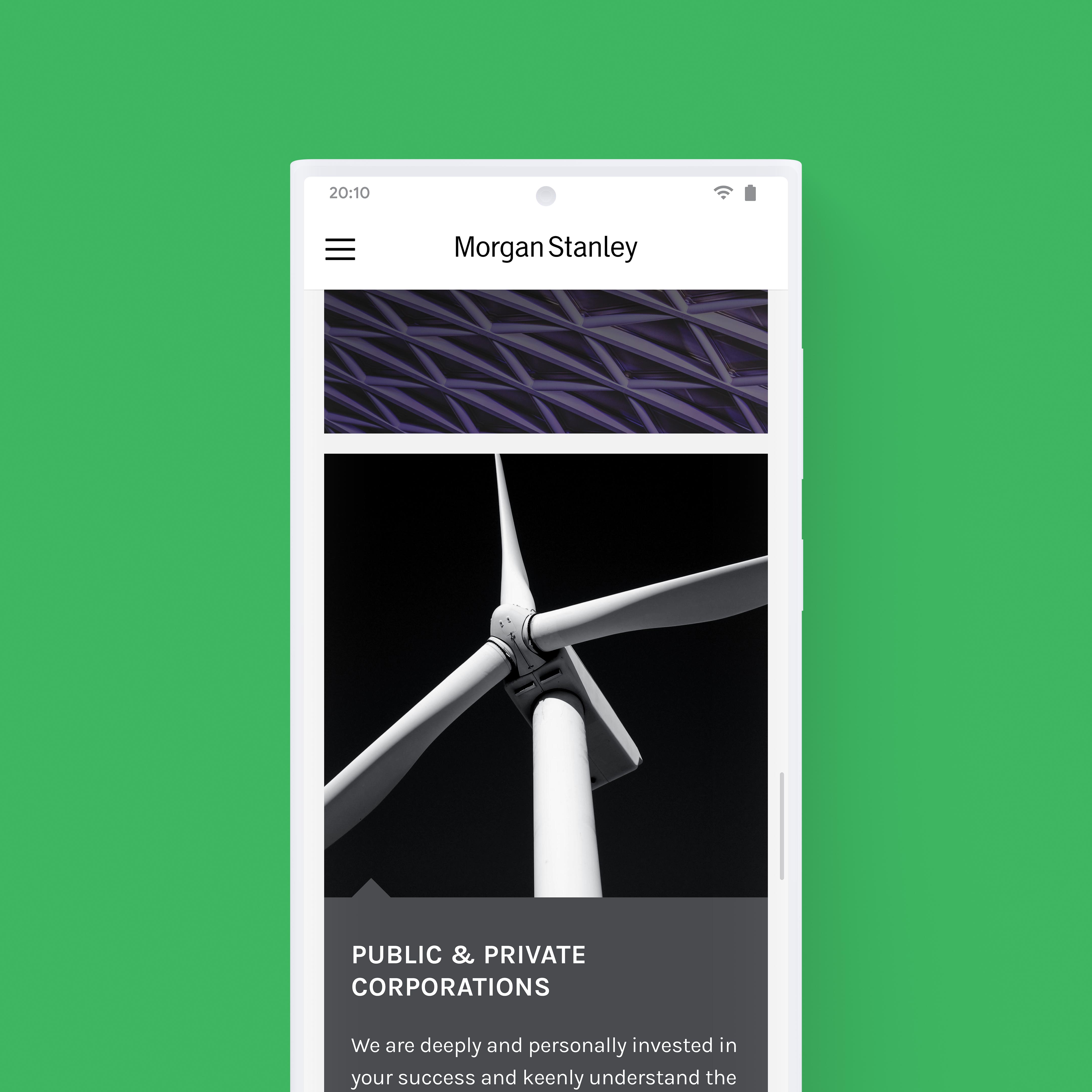
About Morgan Stanley
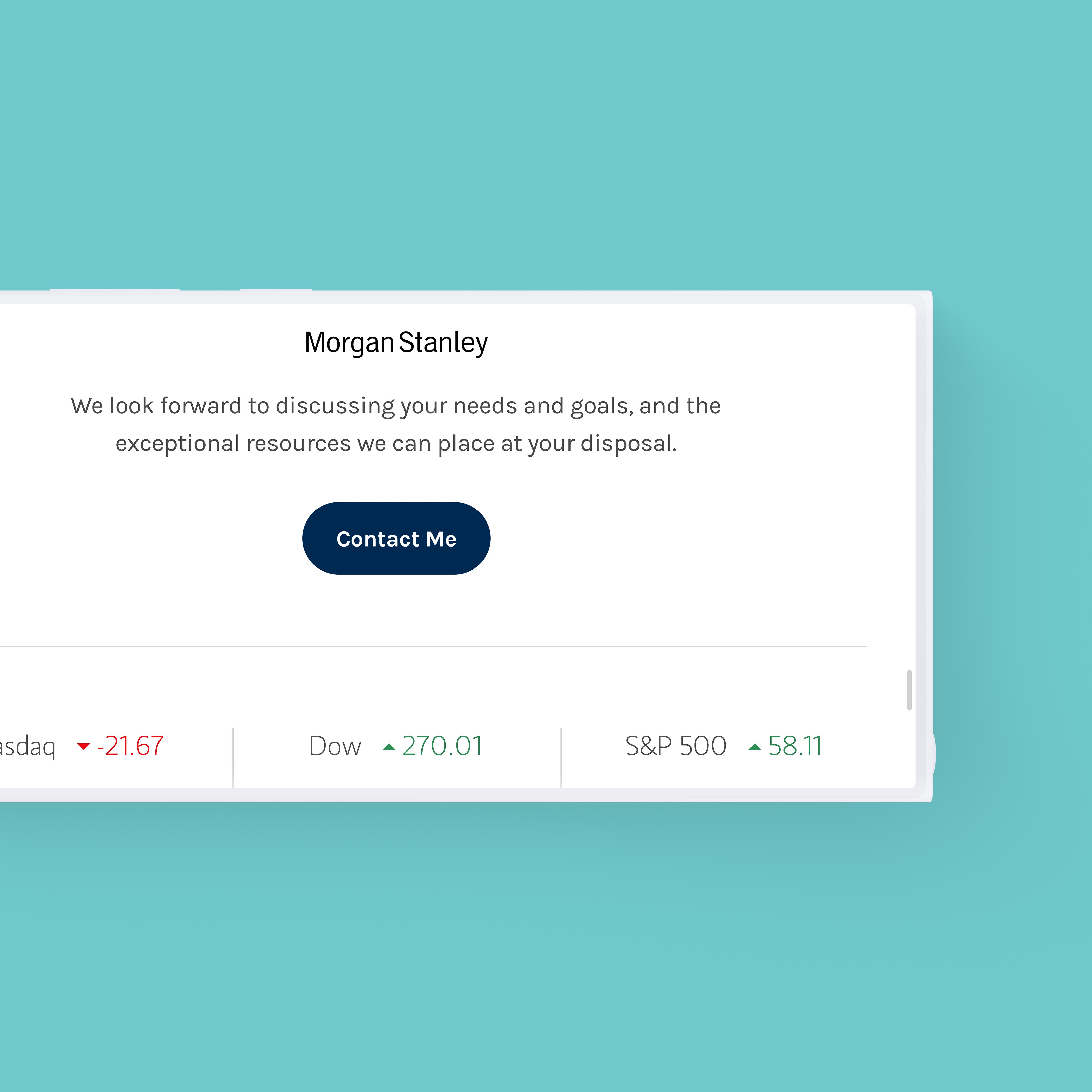
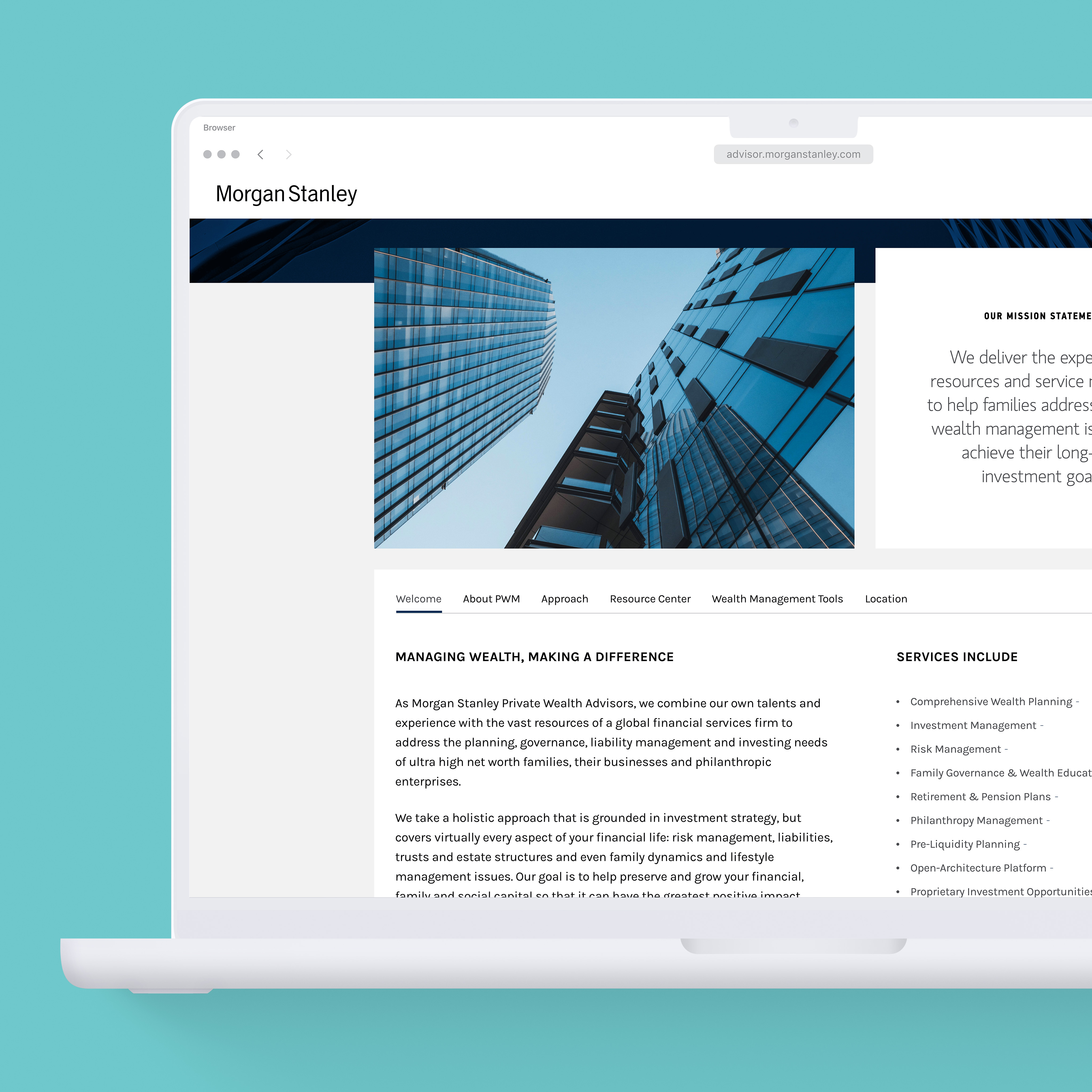
I led UX/UI design for the Morgan Stanley advisor web platform and engineered the design system. One component library — atomic structure and layered on a shared base — generates seven page archetypes on the platform, including advisor, group, branch, complex, brand, and location finder. Each module resolves across six breakpoints, so a single source covers the full responsive range.
Repeatable components, pattern and interaction guidelines, and accessibility standards governed the system. Semantic color tokens aligned to industry standard, and every combination cleared contrast, re-verified each time the client revised the palette. Focus order and screen-reader behavior shipped as tested specifications. Reuse and versioned, tested changes held the platform consistent — one fix to a component propagated to every instance, over two thousand across the platform.
Accessibility
- Ensuring WCAG 2.1 AA compliance was foundational.
- Semantic color tokens aligned to industry standard.
- Focus order specified per archetype.
- Screen-reader behavior documented and tested.
- Contrast re-verified across every palette revision.
Design System
- 750+ component library, atomic architecture: Atom, Element, Unit, Module, Section.
- Seven page archetypes, including location finder, generated from one system.
- Six-breakpoint responsive scale authored per module.
- Components layer engineered on a shared base library - 2,000+ reusable instances.
- Token-first color: neutral ramp, brand primaries, semantic error and success.
Tools
- Figma
- Sketch
- Github