Foot Locker
Responsive Web Design and Component Library
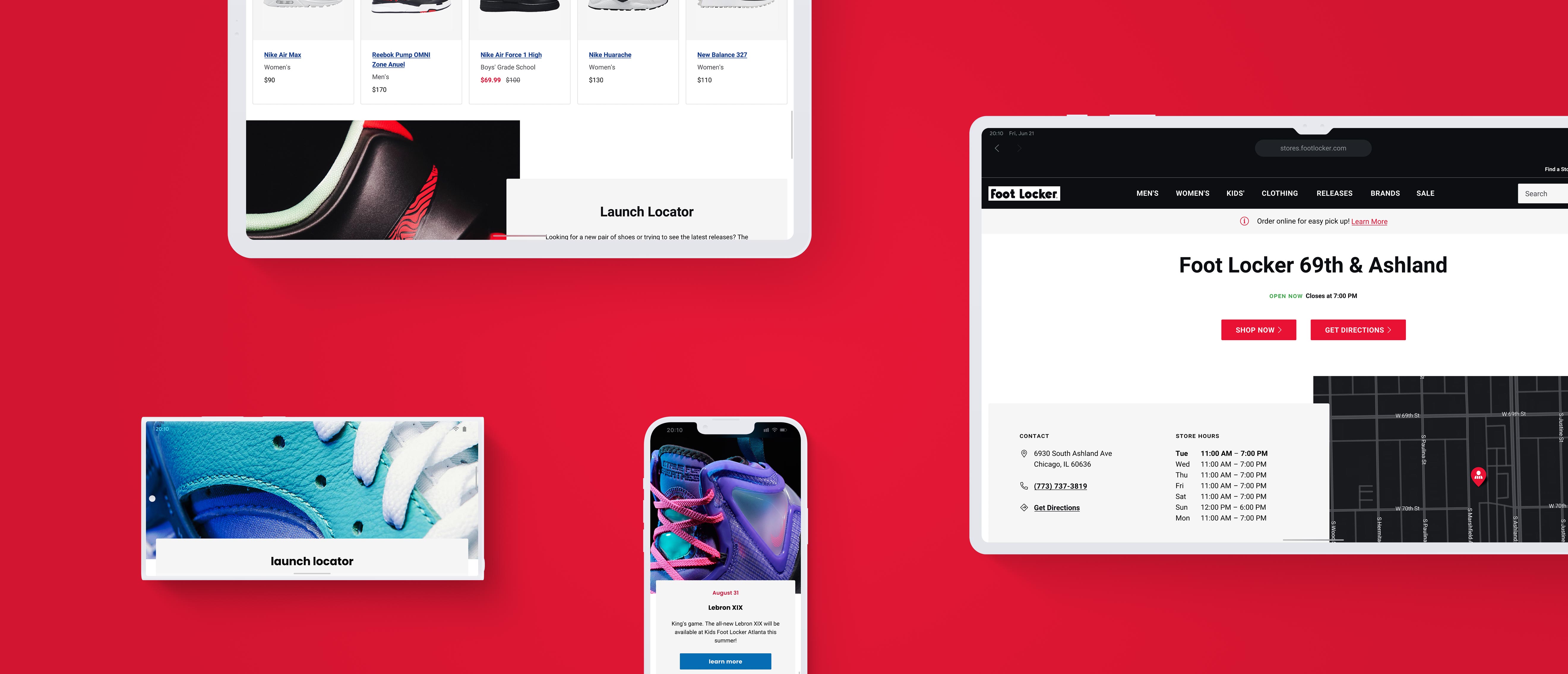
Introduction
A robust and scalable multi-brand design system to serve a tightly regulated network of localized retail websites. Its atomic structure generates four localized sub-branded microsites — Foot Locker, Inc., Kids Foot Locker, Champs Sports, Eastbay—each resolving across six breakpoints from a single source.
- Role
- Lead UX Designer, Design System Architecture
- Scope
- Component system and responsive library spanning one parent and four sub-brands.
- Client
- Foot Locker, Inc.
- Tags
- Design Systems, Component Architecture, Multi-Brand, Responsive, Retail Services
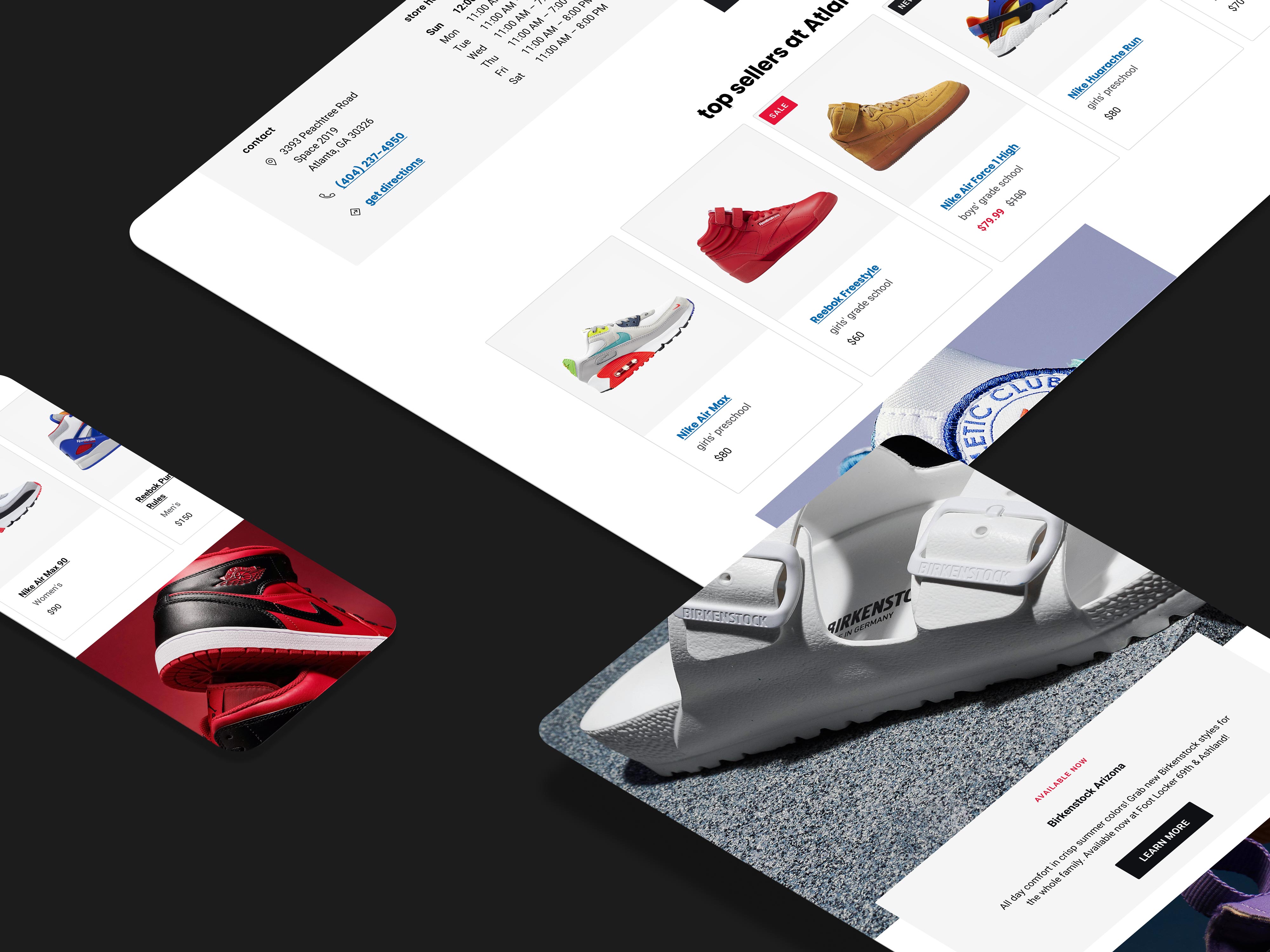
Repeatable Patterns
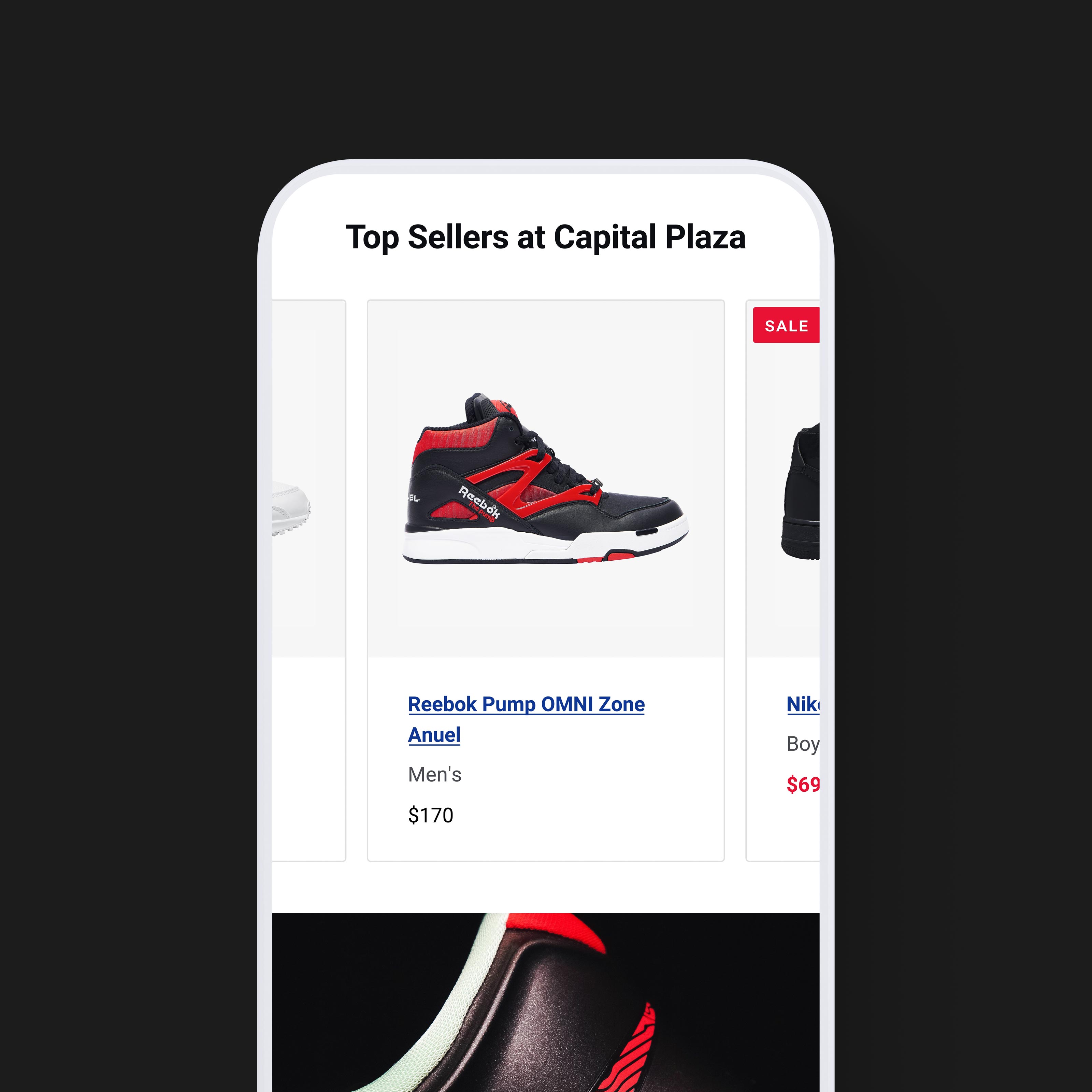
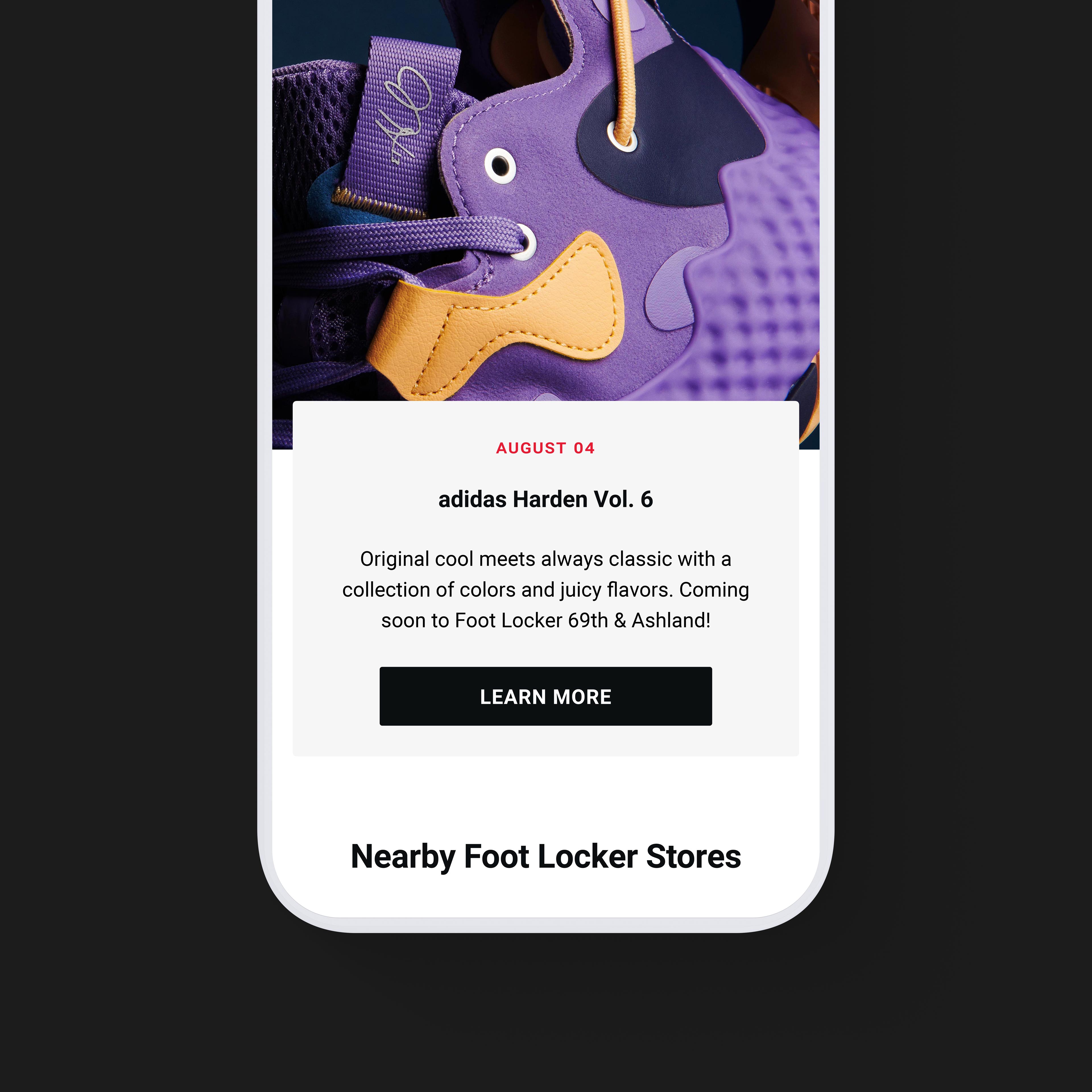
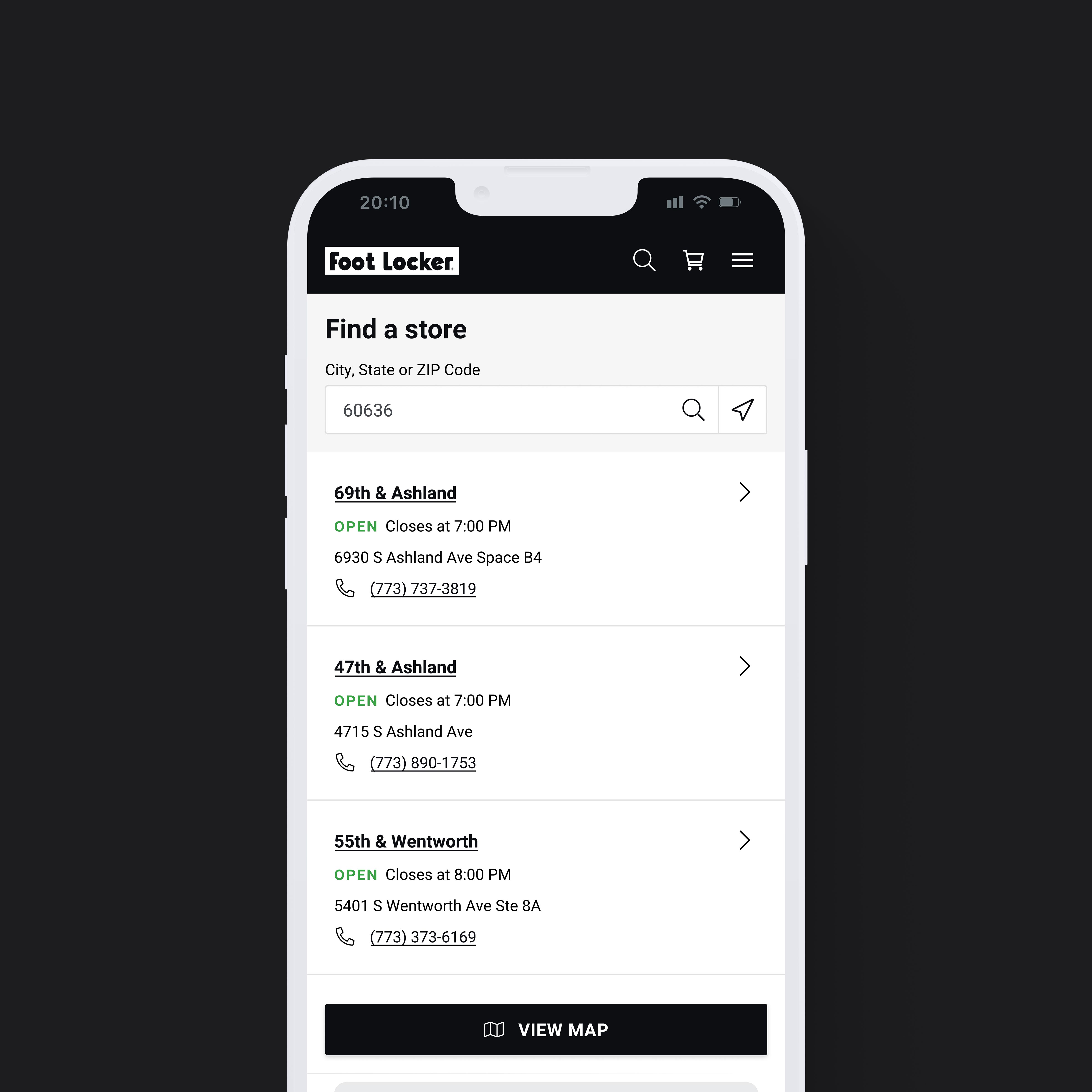
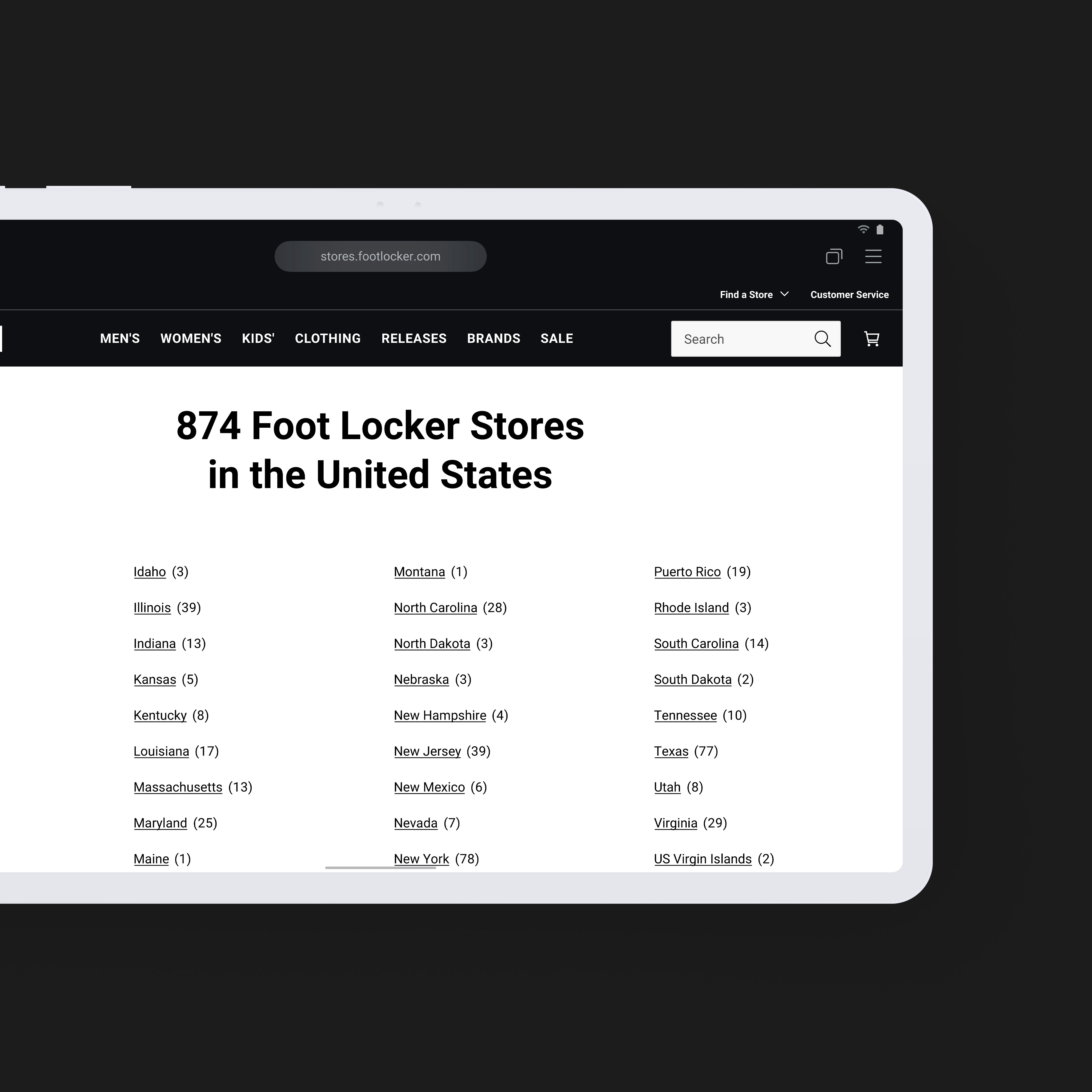
Foot Locker’s design system was hand-crafted to include responsive and flexible UX patterns—the bedrock of a cohesive end-to-end customer experience across multiple channels.
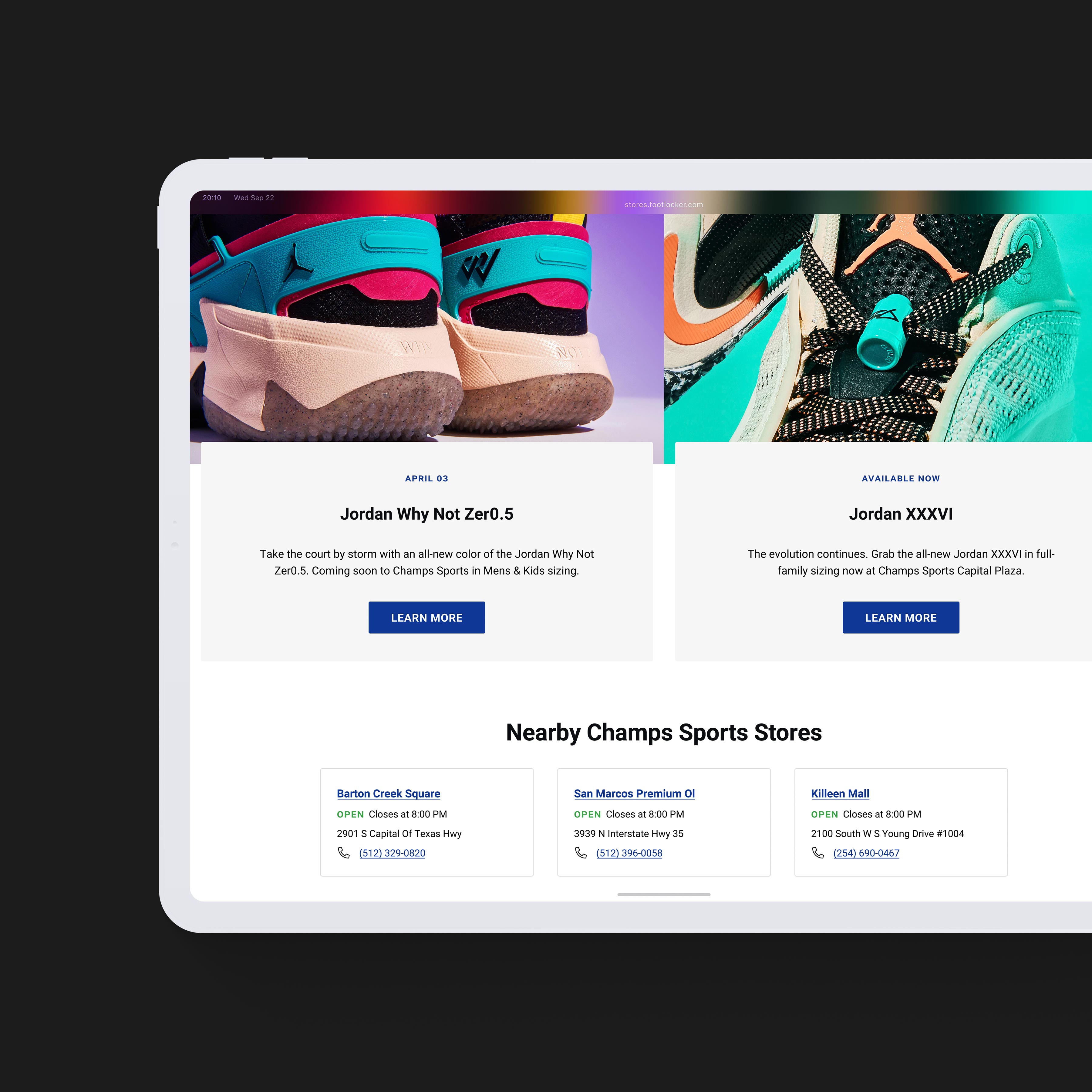
Reusable Components
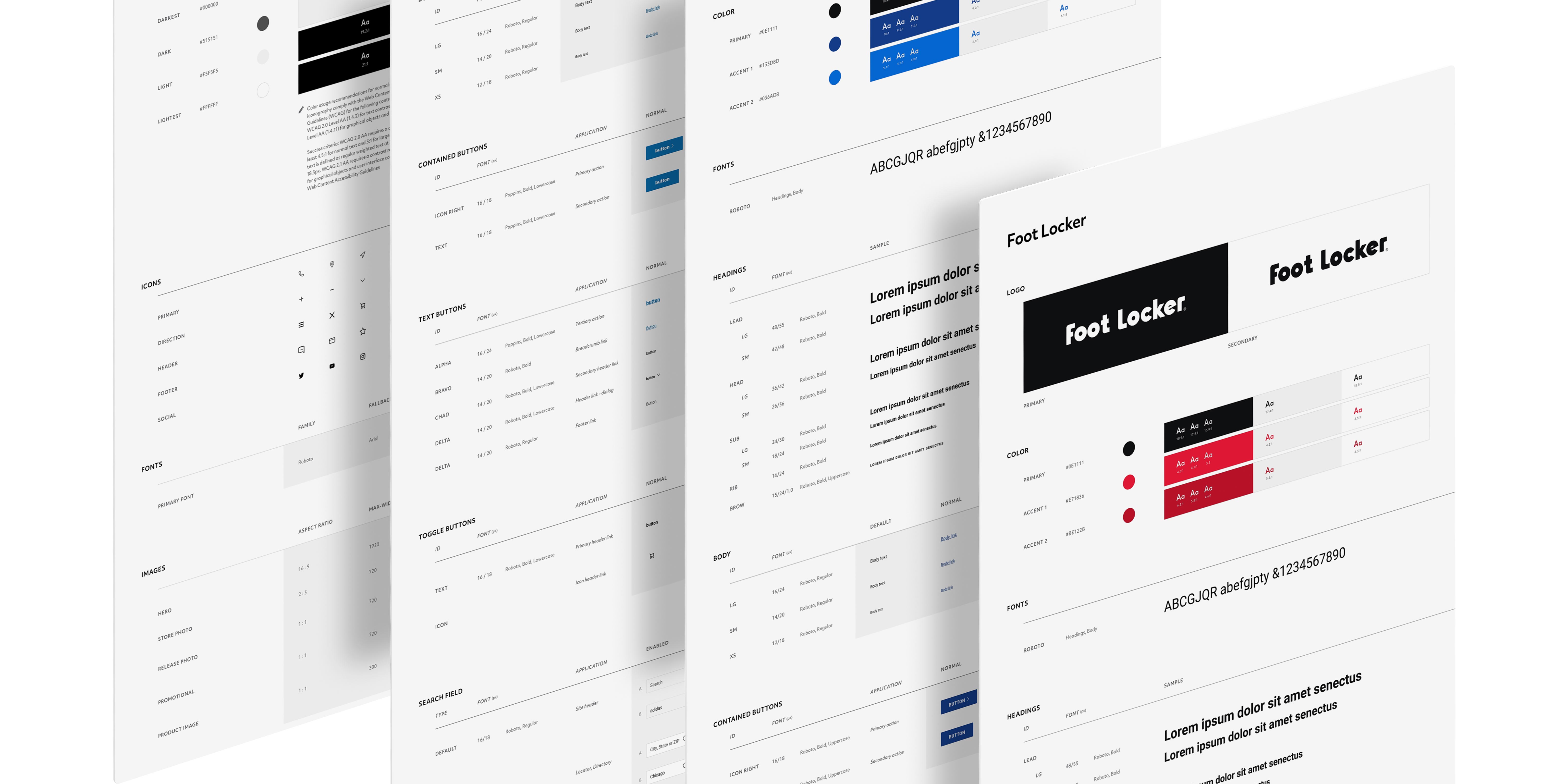
A large, carefully crafted component library that Foot Locker could extend, customize, and build on.
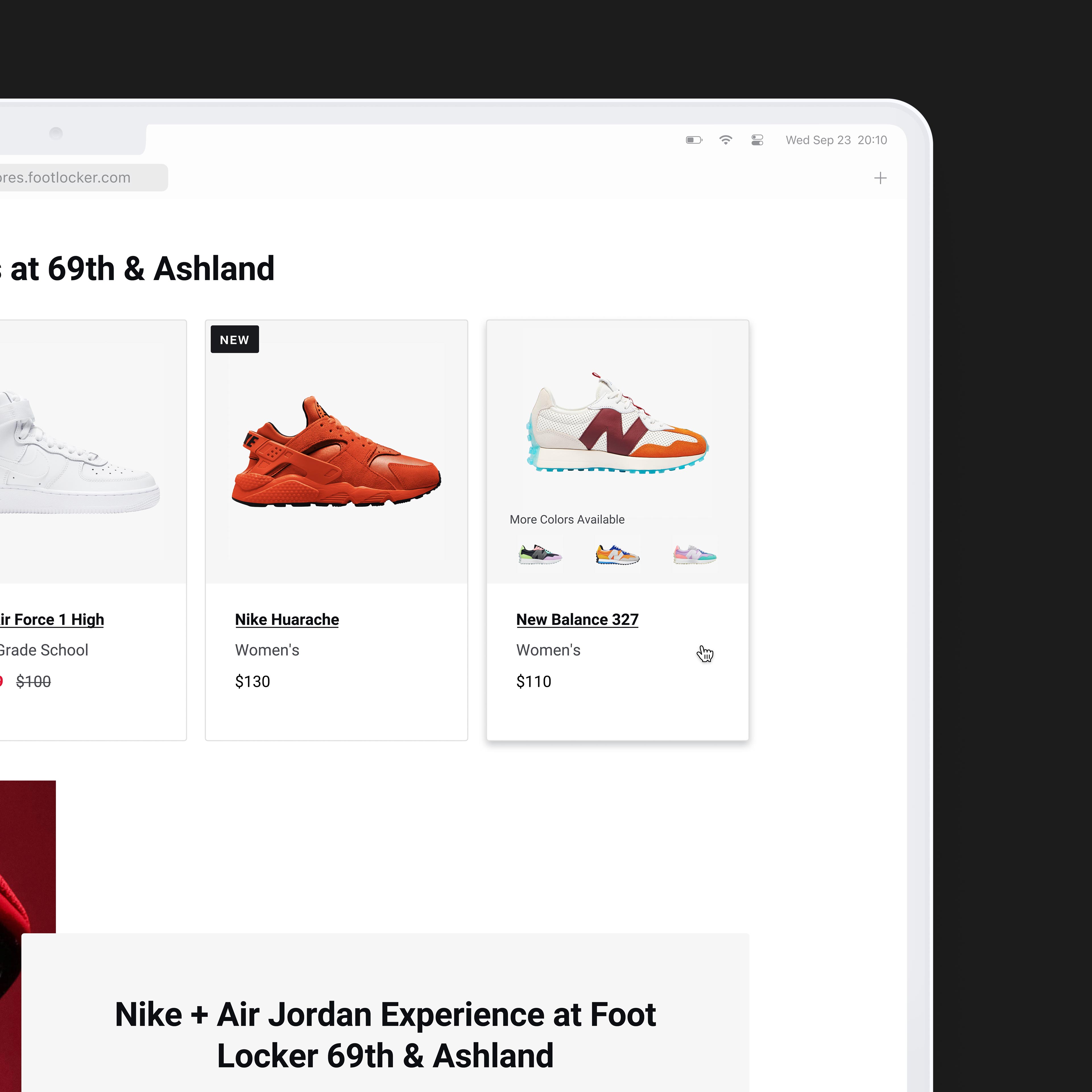
Branded Mapbox Integration
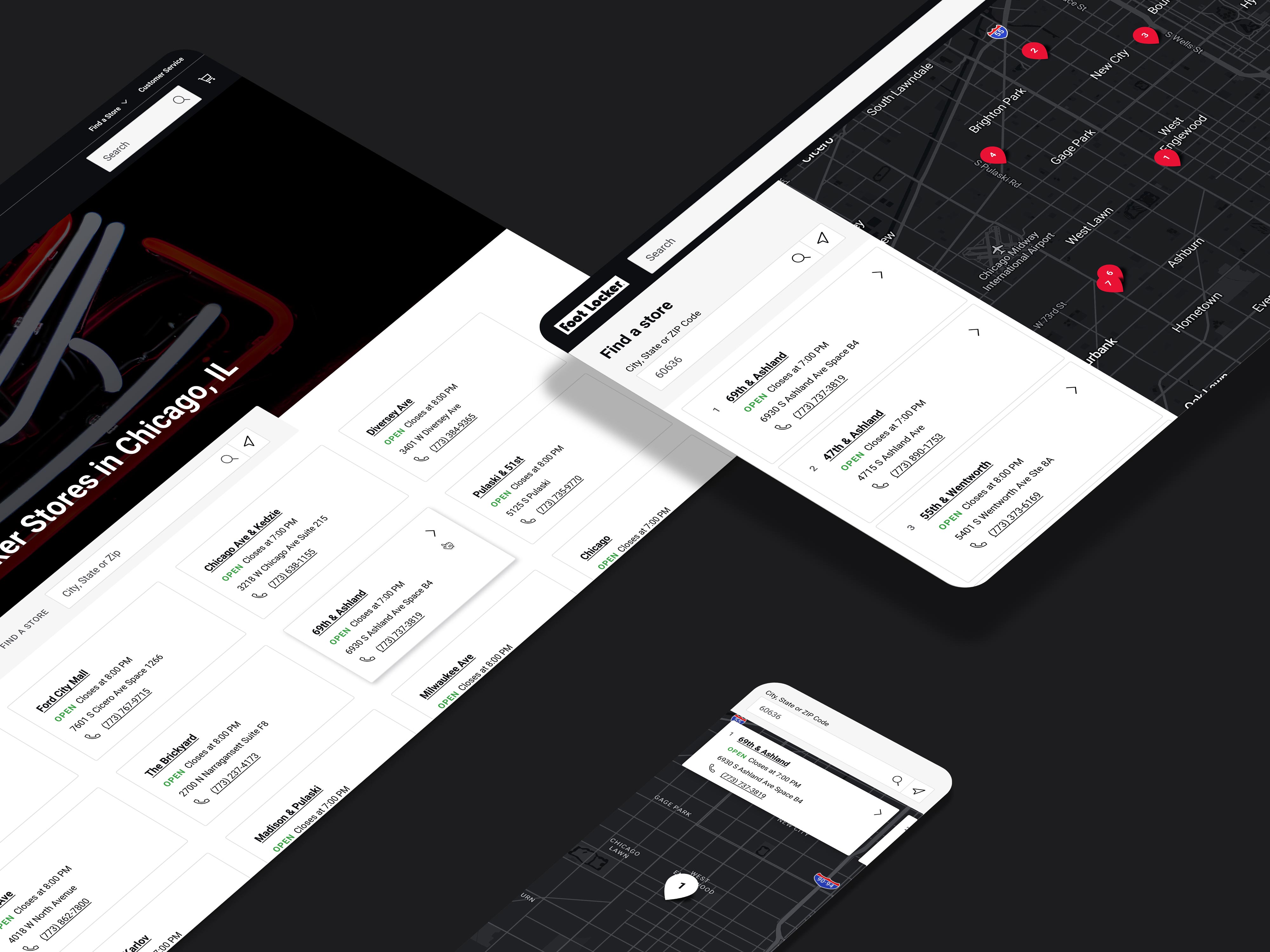
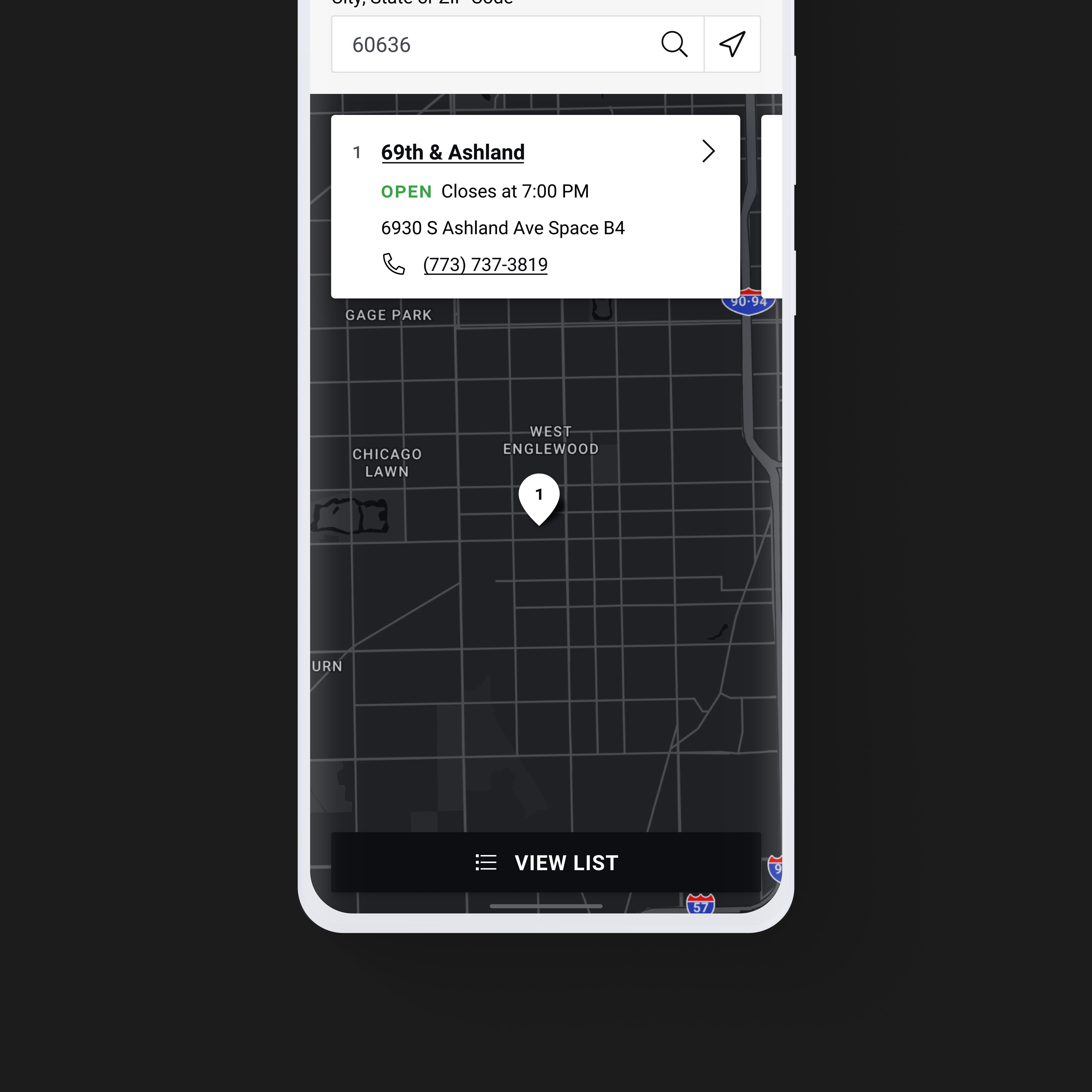
Mapbox Studio used for multi-brand customization and adding an extra flair of character to the navigational and mapping user experience.
About Foot Locker
An exercise in automation, variation, and identity, this design eloquently solves a need for page templates, reusable components, with a wide range of data variation and customization capabilities.
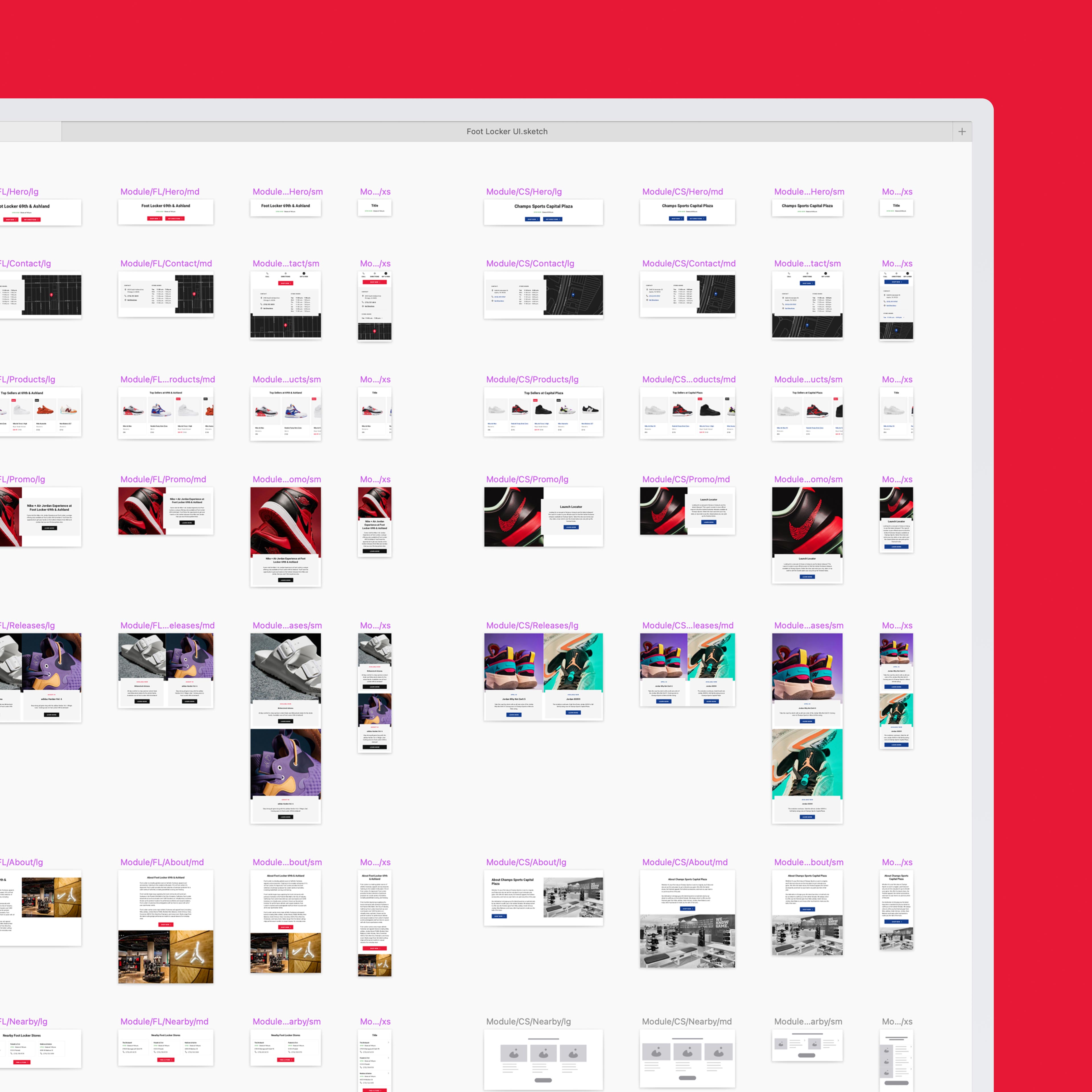
Reusability & repeatability. A modular framework comprised of adaptive content blocks is key to the template design. This modularity provides a fundamental structural consistency across Foot Locker Inc.'s parent brand experience, while giving each sub-brand control over specific data and styling needs.
Accessibility
- Ensuring WCAG 2.1 AA compliance was foundational across all five brand skins.
- Semantic HTML and ARIA landmarks kept product, store finder, and events templates navigable by screen reader.
- Color contrast validated independently for each sub-brand's palette before launch.
- Keyboard-accessible carousels and filters replaced mouse-only interaction patterns.
- Alt text and focus order standardized across every localized microsite.
Design System
- Atomic component library scaled across one parent and four sub-brands from a single source.
- Six-breakpoint responsive scale authored once per module, inherited by every brand.
- Adaptive content blocks let each sub-brand localize copy, imagery, and styling without forking the template.
- Mapbox Studio integration themed to match each brand's visual identity.
- Reusable page templates — product, store finder, events, about — cut new-microsite build time significantly.
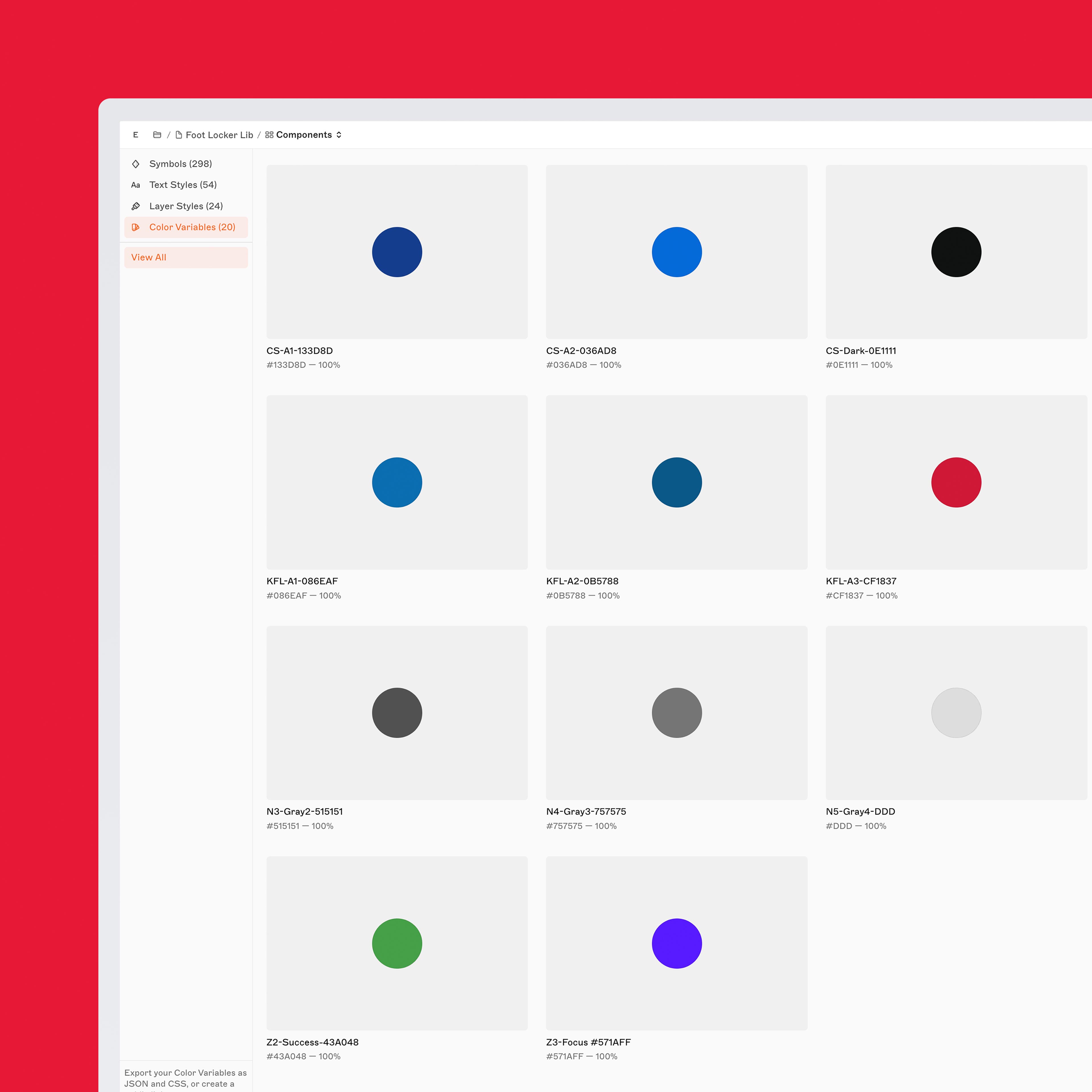
- Token-based theming isolated brand-specific color, type, and logo swaps from shared layout logic.
Tools
- Figma
- Sketch
- Github
- Mapbox